Steve McQueen – Tate Modern, London
5 March 2020 § Leave a comment
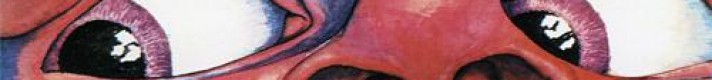
Steve McQueen is now familiar to us for his critically acclaimed films for cinematic release; most specifically the Oscar-winning 12 Years a Slave (2013) but he has also made Hunger (2008), Shame (2010) and Widows (2018).

Less widely known, was that well before this, McQueen was a highly regarded visual artist, winning the Turner Prize in 1999. It is this side of his output that brings McQueen to the Tate Modern in an exhibition that features 14 major works spanning film, photography and sculpture.

This is the first survey of his work in the UK for over 20 years, offering a timely opportunity to experience the depth of McQueen’s visual art career in this country for the very first time.
The single sculpture is Weight 2016, a forgettable sculpture first exhibited at the recently closed Reading Gaol. Presenting a gold-plated mosquito net draped over one of the prison’s metal bed-frames to create a shimmering apparition. Weight unsuccessfully ’explores the relation between protection and confinement, the physical and the spiritual’.

Much more interesting are his films, which vary in duration from a few minutes to over 5 hours. They also vary in presentation; some shown in darkened rooms by timed entrance, others on huge projected screens, and yet more on grainy super 8 projected on to the walls.

What all the works in Tate Modern share, are a powerful determination to show life as it is. The human body, including the artists own, are filmed in unflinching detail. As and when required we are exposed to unconfortable intimacy, extreme physical duress, emotional and psychological pressure, all filmed with an often uncomfortable sense of proximity and engagement.
Despite reflecting output over some 25 years, the films are not arranged in any chronological order, and there is tacit encouragement to take in the films in any order in the open plan arrangement of the gallery exhibits as well as to re-view and re-examine them. There are unfortunately significant gaps such as the pre-1999 works created for the Turner Prize and many recent works, but the exhibition nevertheless spans the artists practice well.

One of the first works encountered is Once Upon a Time (2002), replaying the bizarre images sent in to space by NASA in 1977 reflecting a utopian world strangely free of poverty, disease and conflict accompanied by an unintelligible invented language.

Alongside is Static (2009), a deliberately un-static and disorienting close-up portrait of the Statue of Liberty filmed from a moving helicopter.

In the red-tinted short Charlotte (2004) the actress Charlotte Rampling has her eye pushed and prodded by the artist whilst, shown opposite in Cold Breath, McQueen does the same to his own nipple first gently and then with unexpected violence.

The film installation Ashes shows a two-sided story on two sides of a screen. One side is a joyful ride on a fishing boat bobbing in the sunny Caribbean, the other features preparations for a funeral. Ashes, the male subject was sadly caught up in a deadly drugs deal.

The black singer and activist Paul Robeson, or more specifically the record of his 30 year FBI surveillance, is the subject of the mediocre End Credits. Secret documents run on the screen for an unwatchable 5 hours with a deadpan commentary listing all the redactions.

The masterpiece of the exhibition is undoubtedly the dark and intensely claustrophobic Western Deep (2002) – a journey down in to the world’s deepest gold mine. From the start we are plunged into intense darkness with just overbearing sound of the rattling mineshaft lift. In grainy Super 8 faces flicker in and out of the picture before the cage arrives deep underground.
We smell the sweat and feel the heat as the miners labour in the roar of heavy machinery. Sometimes there are sudden silences or bright lights, each as uncomfortable as the intense darkness or unbearable noise. We cannot help but be transported into the daily working hell of the miners. It is a shocking and visceral experience.

McQueen’s work does not always succeed quite enough to engage us in a gallery setting, however you cannot question the commitment of the artist to his expression of the often harsh and troubling realities of life, and the revelations of inequality, untruth or injustice. Even if only part of the exhibition hits home, it is nevertheless essential viewing.
Steve McQueen is at Tate Modern London, until 11 May 2020
Also published on www.cellophaneland.com
For more information visit Tate Modern
Atlas of Brutalist Architecture – Phaidon
15 November 2018 § Leave a comment
For the launch of this spectacular new publication from Phaidon we were kindly invited on a tour of some of London’s major Brutalist landmarks. Starting at the Barbican on the Southbank and proceeding via a series of impressive landmarks like Centre Point and The London College of Physicians it was pointed out by our insightful guide that much contemporary architecture, almost inevitably, runs through a love/hate/love cycle.

Brutalism is an architecture that has perhaps suffered more, on this roller coaster of critical opinion, than many others. Surely most styles have never been quite so universally hated? Was it this passionately deep dislike from many quarters that has also ultimately pushed others to an equally heart-felt passion?

It seems to be only in the last decade or so that there has been a largely universal recognition of the quality and values of Brutalism as a unique style that is worth preserving and enjoying. A cautionary word that the task is not yet complete is provided by the book’s list of properties scheduled for demolition – of which appallingly half are in the UK.
In this context is is perhaps remarkable that so much great Brutalist architecture has still survived but it is also necessary to recognise the great buildings that have not. Phaidon’s Atlas of Brutalist Architecture features all of them – lost or otherwise and is undoubtedly the most complete and wide-ranging survey of this still controversial movement.

Proving that the style was truly international, the volume records 850 buildings from more than 100 countries and these are organised in to nine continental regions. Each building is illustrated with black and white (what else?) images, succinctly described and categorised by use (used/abandoned), status (listed listed or scheduled for demolition) and condition.
Within this list not only contains a who’s who of twentieth century architecture – masters like: Marcel Breuer, Le Corbusier, Carlo Scarpa, Ernö Goldfinger, Frank Lloyd Wright, Louis Kahn and Oscar Niemeyer – but also those lesser known or simply galvanised by the style.

Interestingly, for a movement that many would allocate to a specific period now past the authors argue that the origins of Brutalism lie much earlier that the traditionally accepted period from 1950 to mid 1970’s and feature for example Erich Mendelsohn’s Hat Factory in Germany built in 1923.
Similarly, the conventional end date of the mid 1970’s has been considerably extended, helped along by the widespread international use of structural concrete. Architects like Herzog & de Meuron with the Signal Box in Basle, Switzerland from 1994 and Stephen Hall at M.I.T in 2002 show that inspiration gained from the movement has continued up to the present day, and undoubtedly will continue and evolve in the future.

Phaidon must be praised for their commitment with this substantial book which in style, size and weight is also deliberately evocative of a Brutalist object. As they headline the book on their website: Big. Bold. Brutal. The cover is both embossed and roughly textured, bold black lettering emerges from a montage of iconic Brutalist buildings whilst the spine text too large and proud to be confined, wraps itself round on to the covers.
The Atlas of Brutalist Architecture not only successfully records Brutalism as a movement, but expands its scope, develops our understanding and inspires further evaluation. A definite must for any architecture or concrete-lovers (well built) coffee table.
To purchase visit www.phaidon.com
This post was also published at CELLOPHANELAND*
SPECIFICATIONS:
Format: Hardback
Size: 340 x 240 mm (13 3/8 x 9 1/2 in)
Pages: 560 pp
Illustrations: 1000 illustrations
ISBN: 9780714875668
California Captured by Marvin Rand
11 November 2018 § Leave a comment
Mid century modern is one of today’s most prominent design trends – especially in California. Cruise around say, Los Angeles or Palm Springs and you will find no end of shops and businesses offering original, reproduction or imitation mid century furnishing. Around the world decor, design and architecture reflect a renewed interest in the period.
With this significant revival comes a desire to look in more detail at this era and perhaps re-assess the major figures. Phaidon’s latest publication, California Captured is therefore a very welcome look at the pioneering architectural photography of Marvin Rand.

His stylish and precise photography perfectly captured the aesthetic of the era but Rand was much more than simply an observer – an intrinsic part of the movement he worked hand in glove with some of the period’s major movers and shakers.
Helping to shape developments in architecture from within his imagery was vital in a period where Angelenos sought a new and modern style within an optimistic and expanding city. A circle of photographers, magazines and architects brought the latest designs, themselves enabled by the latest technologies, to an eager public. The new architecture boomed and along with Rand the associated trades flourished.

Born in downtown LA he enrolled at Art Center College of Design joining a circle of avant-garde artists and designers, including Saul Bass, Lou Danziger and Charles and Ray Eames. Through this he met Esther McCoy, an influential LA architectural historian, who would help launch his career.
Rand worked with many of today’s cutting-edge architects through the key decades of the fifties and sixties, his client list a who’s who of architects past and present, including the likes of Eames, Louis I. Kahn, Craig Ellwood and Frank Gehry.

But not only was Rand active in photographing the new but he eagerly recorded the rapidly disappearing architecture of LA. He helped in restoration and preservation, spending time photographing distinguished buildings threatened with destruction.

Rand always insisted that the architecture spoke for itself. He photographed with a light hand eschewing artifice and unnatural lighting. His skill lay in spotting unseen angles and capturing the essence of any building. Unlike most of his peers he often worked alone whilst insisting on doing all of his own darkroom work which he considered of equal importance to the quality of the original image.
Remarkably it was only as recently as 2012 that his archive of some 50,000 images was ‘re-discovered’. Having been carefully organised by Rand before his death in 2009 it had remained stored away within family possessions.

Rand was amongst a small group of photographers who worked to record and promote the architecture of the period. Julius Shulman is usually the pre-eminent name but this book elevates Marvin Rand to a significant position within the group and is an essential addition to any collection of architectural photography.
California Captured by Marvin Rand is available via this link at www.phaidon.com
This post was also published at CELLOPHANELAND*
Hardback £49.95
240 colour illustrations
240 Pages
290 x 250mm
ISBN 97807 1487 6115
America’s Cool Modernism – the Ashmolean Museum, Oxford
7 November 2018 § Leave a comment
Most histories of modern art in the USA seem to skip through the period after the Great War in Europe. It is easy to do, after all the huge burst in European art movements that occurred in the early part of the 20th Century had by then subsided. The war had split groups and killed artists with those surviving largely shocked and confused with the new world order, unsure of new directions.

In Europe, expressionism and surrealism became prominent but there has always seemed that there was less to grab the attention over the pond. In the USA the effect of the war was less profound but still notable. It began with the Roaring Twenties and the Jazz Age, to be quickly followed by the Depression in late twenties and thirties. We think of progress in technology, film and design, perhaps ‘art deco’, but what of art?
It is a welcome event therefore to see America’s Cool Modernism arriving at the Ashmolean. This is an exhibition that looks more closely at this period with for example early works by Georgia O’Keeffe, photographs by Alfred Stieglitz, Paul Strand and Edward Weston and cityscapes by Edward Hopper.

There are plenty of works that have never travelled to the UK and there is the opportunity to learn of pioneers of modern American art whose work is less well-known in the UK, particularly Charles Demuth and Charles Sheeler.
It is often an anxious look at the period made with a cool detachment and emotional restraint. It is a world where people are largely missing from observations of eerie and empty places. But is it lost of hope or inspiring of redemption?

Of course we have Edward Hopper. His Manhattan Bridge Loop (1928) has a gloomy atmosphere with a tiny, solitary pedestrian whose walking pace is at odds with the bridge’s traffic. The African American Jacob Lawrence shows the harsh experience of marginalised groups seeking a better life.
Similarly bleak is the art of George Ault. In New York Night No 2 (1921) we see a cold and inhuman Manhattan in a dreary fog.

But not all the art is angst ridden. There was an alternative and altogether more optimistic viewpoint. Demuth’s I Saw the Figure 5 in Gold (1928), was dedicated to the poet William Carlos Williams, and in more particularly to his poem The Great Figure: Among the rain, and lights, I saw the figure 5, in gold, on a red, firetruck … It consists of a giant, stylized ‘5’ painted in bold colours, evoking new styles of advertising and a remarkable anticipation of Pop Art.

Another stunning evocation of Pop is found in Stuart Davis’s painting Odol. This is Warhol’s Brillo and Campbell’s soup cans but painted nearly forty years earlier. Davis incorporated imagery from logos, commercial signage, and modern packaging. This is a sleek, streamlined ode to a bottle of mouthwash (he also painted Lucky Strike, a visual riff on a pack of cigarettes). His work is usually presented as simply visual ’synthetic cubism’ inspired by earlier modernist masters. We would give him more credit and suggest it is a far more knowing representation of – let’s just call it – ‘early pop’ culture.

There was great progress over this period in design, architecture and building techniques and the grand structures of this machine made world feature prominently. Skyscrapers and bridges are studies in geometry and cities sharp and modern. Louis Lozowick’s prints capture the energy with soaring buildings while Ralston Crawford and Sheeler depict the factories of industrial America as glorious new cathedrals.

Georgia O’Keeffe looks over rooftops and chimneys in East River from the Shelton Hotel. It is the epic and almost abstract American landscape, but instead of out in the desert she is in the heart of the city. With Black Abstraction (1919) she is even more abstract.

This is a distinctly American modernism when artists were trying to create a distinct visual language rooted in American landscape and tradition. We see here a cool restrained and pared-back aesthetic featuring smooth surfaces, pure lines and a lack of figures. The Ashmolean allows us to see the birth of a new distinctly American style in this tremendous exhibition.
America’s Cool Modernism: O’Keeffe to Hopper is at the Ashmolean Museum, Oxford until 22 July 2018
For more information visit www.ashmolean.org
Frieze London 2018
5 November 2018 § Leave a comment
As soon as Frieze makes its annual appearance in Regents Park everyone knows that it is time to check out the London art scene. The annual schedules of the galleries – both commercial and public – are all heavily weighted towards the Autumn and the most important names carefully lined up for exhibition. This is the time when anyone can get an all-round view of global trends without leaving central London.

With the twin clouds of Brexit and falling market confidence hanging over the art world, it was good to arrive at Frieze to receive a David Shrigley newsflash accompanying the Art Newspaper – NEWS: PEOPLE GATHER IN LARGE TENT. It helped to lighten the mood – for more of Shrigley you could visit Stephen Friedman where he took over the whole stand and showed some witty neon works alongside his more usual sketches and bonkers animations.

Also lightening the mood were US artist Julia Scher’s pink-clad pensioner security guards who were regularly seen patrolling the fair.

As seemingly has been the trend for several years now the big institutional-type works were largely absent from a show that was dominated by smaller and mid-ticket works. An ugly and rather pointless exception was Tatiana Trouvé’s The Shaman which nevertheless apparently sold on the first day. Many other big name – big ticket items were perhaps held back for gallery events or even Frieze Masters.
Swiss artist Urs Fischer dominated the show entrance at Gagosian with a suite of iPad paintings printed on to reflective aluminium panels. All show his New York home with the image disintegrating across each set as if digitally erasing itself.

Lisson Gallery had works from Marina Abramovic and John Akomfrah , whilst at David Zwirner were Wolfgang Tillmans and Chris Ofili. Tacita Dean was at Marian Goodman Gallery’s stand.
This years #metoo angled theme was Social Work, exploring how women artists looked at political activism within their work. With artists including Faith Ringgold, Sonia Boyce, Helen Chadwick, Nancy Spero and Berni Searle it was however somewhat underwhelming and could easily be passed largely unnoticed.
As usual though there was plenty to enjoy and here are a few of the other works that caught our eye:


Last but not least, as you leave the fair in Regent’s Park, perhaps to venture up to Frieze Masters, some twenty five different sculptures were dotted throughout the greenery and included Kimsooja (above), Rana Begum , Tracey Emin, Conrad Shawcross and Elmgreen & Dragset. They will remain until the end of Frieze week.
CELLOPHANELAND* were guests of Frieze London
For more information visit www.frieze.com
This post was also published at CELLOPHANELAND*
Glen Brown, Come to Dust – Gagosian Mayfair, London
20 February 2018 § Leave a comment
“I am rather like a Dr. Frankenstein, constructing paintings out of the residue or dead parts of other artist’s work. I see their worlds from multiple or schizophrenic perspectives, through all their eyes. Their sources of inspiration suggest things I would never normally see – rocks floating in far-off galaxies, for example, or a bowl of flowers in an 18th-century room, or a child in a fancy-dress costume. The scenes may have been relatively normal to Rembrandt or Fragonard but because of the passage of time and the difference in culture, to me they are fantastical.” Glenn Brown

Glenn Brown’s latest show, amazingly his first major UK one since 2009, takes advantage of the large spaces of Gagosian’s recently opened (see here) Mayfair gallery. This is a hugely impressive, state of the art space and Brown’s classical themes and inspirations are well suited to this gallery’s wooden floors and dark walls as opposed to the cliched concrete floored white cubes found in most commercial spaces nearby.

The lighting is low and each work is spotlight whilst besuited security guards add to the feeling of entering a major London Museum rather than a west end gallery. This seems entirely relevant since Brown appropriates from classical artists that include Rembrandt, Delacroix, Greuze, and Raphael in a variety of genres like landscape, portrait, flower and history painting.

He usually uses Photoshop to distort, merge and colour the selected sources in sophisticated compositions that fuse diverse histories – Renaissance, Impressionism and Surrealism. The original may in turns be obvious or hardly recognisable. Sometimes he puts them in historic gilt frames to confuse us more.

In his oils, hybrid figures painted in intricate swirls reveal the sumptuous potential of oil paint. While these paintings give the illusion of thick impasto with volume, closer scrutiny reveals smooth surfaces that glow with a vital force. Up close form also disappears in complex swirls and vortices as if slipping from memory in some drug induced trance or dreamlike haze.

In graphic works Brown paints using largely black and white lines over a neutral ground. Meticulous, elongated brushstrokes reimagine works from the likes of Raphael and Guido Reni to create depth and animation in portraits that barely seem to exist.

There are also a significant number of sculptures, which we found slightly less successful. Elaborate masses are built from thick ‘strokes’ of coloured paint – perhaps imagine the likes of a sculptural Kossof. Some partially encase nineteenth-century bronze statues with growths of pulsating, gravity-defying paint.

This is a stunning exhibition of formidable technical ability and Brown impresses with an artistic language that transcends time and pictorial conventions. In his unique vision the abstract and the visceral, the rational and irrational, the beautiful and grotesque, churn in a dizzying amalgamation of reference and form. Not to be missed.

Glenn Brown, Come to Dust runs at Gagosian Mayfair until 17 March 2018
For more information visit www.gagosian.com
Wim Wenders: Instant Stories – The Photographers Gallery, London
8 November 2017 § Leave a comment
Anyone familiar with the work of Wim Wenders may suspect that he has more than a passing interest in photography. In two of his movies in particular the use of Polaroid cameras is a vital part of the narrative: in the road movie Alice in the Cities there is a photo-obsessed protagonist whilst in The American Friend, Dennis Hopper snaps himself repeatedly. Both make appearances in the exhibition, the film clip of Hopper showing alongside multiple images taken during the period of filming.

It is not however necessary to have any knowledge of his films to enjoy this exhibition for Wenders is a fine photographer. He is reluctant to admit this, and wants the Polaroids to be enjoyed rather as illustrations of the period and a record of the people and places.

He says “I was learning the craft of filmmaking in those years, and Polaroids were the perfect complimentary tool: as a visual notebook, a quick way of ‘framing’ the world, a verification of my interest in people, places, objects, or simply as a way to remember things.”

Wenders was a prolific Polaroid user, so much so that the company would supply him with cameras and film to test. He himself estimates that he took more than 12,000 Polaroids between 1973 and 1983 although only 3,500 remain. “The thing is,” he says, “you gave them away. You had the person in front of you, whose picture you had just taken, and it was like they had more right to it. The Polaroids helped with making the movies, but they were not an aim in themselves. They were disposable.”

The images are wonderfully evocative. The are instinctive and clever. Sometimes they make clever use of colour and light at others there are moody black and white street scenes. He dips in an out of recognisable styles. In one a car door hangs loosely open, inviting us to complete a story perhaps. In another a pair of spectacles looks back at in front of a blurred cityscape.

There are moments of leisure – a casual image of a bottle of ketchup on a table is cleverly composed and invokes Martin Parr’s casual inspection on culture. An image of Dennis Hopper cigarette in hand is a perfect off-screen image of a celebrity. Stacks of Campbell’s Soup are clearly a reference to Andy Warhol.

Often they were his visual notebook – a way of testing out frames and ideas – but more than that they offered him a kind of liminal space between the subject and the photograph, the photographer and the act of taking a photo, the intention and the outcome.

He is also well aware of the place in photographic history of the Polaroid. “The entire Polaroid process has nothing to do with our contemporary experience, when we look at virtual and vanishing apparitions on a screen … This was a true THING, a singular object of its own, not a copy, not a print, not multipliable, not repeatable.”

Sadly it is now 30 years since Wenders took any Polaroids. “It’s not just the meaning of the image that has changed – the act of looking does not have the same meaning. Now, it’s about showing, sending and maybe remembering. It is no longer essentially about the image. The image for me was always linked to the idea of uniqueness… that whole notion is gone.”
Despite his insistence that this is ephemera not to be taken seriously, when displayed in a gallery and viewed as a body of work there is no doubt that these are important images and easily elevated to the status of ‘art’.

Wenders insists “The meaning of these Polaroids is not in the photos themselves – it is in the stories that lead to them. That’s why the exhibition is called Instant Stories – the catalogue is a storybook more than a photo book.” This is a ‘story’ that is absolutely essential viewing for any photographer or film maker whilst still being a rich and fascinating experience for everyone.
Instant Stories is at The Photographers’ Gallery, London until 11 February 2018
CELLOPHANELAND* were guests of The Photographers’ Gallery
Basquiat: Boom for Real – The Barbican Gallery, London
2 November 2017 § Leave a comment
Do not come to the latest Barbican Gallery exhibition Basquiat: Boom for Real expecting a straightforward show of Jean-Michel Basquiat’s work. This is rather more than that and all the better for it. This is an exhibition where, in the words of Jane Alison, the Barbican’s Head of Visual Arts, we can “see those works in the context of the New York scene of the 1980s.” We therefore get videos, photographs, music, film, books and paintings, where Basquiat is presented as a multidimensional artist weaving between media.

New York at that time was certainly a rich melting pot. A dangerous and violent city on the edge of bankruptcy, it housed a thriving cultural scene. Basquiat, young and black has often been pigeon-holed as a a poor outsider, who developed from homeless graffiti artist to gallery favourite. The truth is rather different.

From a relatively wealthy family, Basquiat went to a private school, was well educated and a talented artist and was admiring Renaissance masters in New York galleries in his teens. Having dropped out of college, he briefly ran away from home, stayed with friends and scrawled graffiti as ‘Samo’ (a play on ‘same old shit’), although its style was not ‘from the streets’ but always from an artist insider critiquing the contemporary art scene.

The Barbican Gallery divides the show in to some fourteen sections. From Samo graffiti we then see the beginning of his stratospheric rise in a recreation of the New York/New Wave exhibition. A landmark show where despite including the likes of Andy Warhol, Nan Goldin and Robert Mapplethorpe, the young Basquiat was singled out for admiration.

Between examples of his work we get to learn plenty about the post-punk underground art scene: The Canal Zone, a graffiti covered downtown loft/art space brought him together with collaborators for collage and postcards; the Mudd Club was where he hung out and performed with his band; at Area he hung out with Keith Haring or Madonna whilst dj-ing sets on a Brian Eno created sound system.

A key element of the exhibition is a remarkable film, Downtown 81, a chronicle of a day in the in the life of a down and out artist, for which Basquiat was chosen to play the leading role. It is essentially a prescient version of his real life as we see him spraying Samo-tagged graffiti and hawking his art (some of it in the show) around galleries as he visits clubs, watches bands and interacts with the larger than life local characters.

Glenn 1984 – Jean-Michel Basquiat
If so far we haven’t mentioned his art much, it is with good reason – there is not a lot here. We do see his graffiti, collages, postcards, sketches, polaroids and even his graffiti covered fridge. We also see books, records and photographs as the Barbican outlines his jazz, art and classical influences.

Jean Michel Basquiat – King Zulu 1986
Where we do see his larger works – vibrant, raw imagery, abounding with fragments of bold capitalised text – they offer insights into both his encyclopaedic interests and his experience as a young black artist with no formal training. New scholarship sheds light on some of his most acclaimed works – sampling from an extraordinary breadth of source material – anatomical drawings to bebop jazz to silent film.

Untitled (Pablo Picasso) 1984 – Jean-Michel Basquiat
“Untitled” (1981), for example, includes variations of the name Aaron. While Basquiat’s father understood it to be a reference to baseball player Hank Aaron, the Barbican Gallery posits other allusions: a character in Shakespeare’s play “Titus Andronicus,” and the brother of Moses in the Old Testament. Two letters also feature individually, “A” and “O,” and relate to a passage from Revelation that fascinated Basquiat: “I am Alpha and Omega, the beginning and the end.”

Jawbone of an Ass 1982 – Jean Michel Basquiat
The label for his 1982 painting Jawbone of an Ass, he lists historical figures including Hannibal, Machiavelli, Savonarola, Sappho and Rameses II, is a vision of world history as a ceaseless round of wars. Cartoon monsters with savage teeth express the violence of the painting’s Biblical title. In the bottom right, a black boxer hits a white opponent.

He worked surrounded by imagery: open books, pages from magazines and photographs laying around him as the TV flickered and jazz music played. He worked rapidly absorbing influences from anything and everything. Sometimes the resulting art is hard to like, at others remarkably fresh, powerful and multi-layered.

“Untitled” (1982) – Jean-Michel Basquiat
Strangely there is nothing here about his heroin addiction and untimely death at just 27, and we do not know if there were lost chances to save him from self-destruction. We are ultimately left to ponder what sort of art this talented and elemental force would have continued to produce if it were not for his tragic end.
Basquiat: Boom for Real is on at the Barbican Gallery in London until 28 January 2018.
All images © The Estate of Jean-Michel Basquiat, Licensed by Artestar, New York
Rachel Whiteread – Tate Britain
14 October 2017 § Leave a comment
Now that Frieze, Frieze Masters and the PAD art & design fair are packed up we can move our attention to what else is going on in London this month. October is always chock a block with inviting exhibitions it is hard to know what to recommend first.

The Tate Gallery seems a pretty good place to start where Tate Britain are currently presenting the most substantial retrospective survey to date of work by Rachel Whiteread.

The exhibition reveals the extraordinary breadth of her career over three decades, from the four early sculptures shown in her first solo show in 1988 to works made this year especially for Tate Britain including Chicken Shed, a new concrete sculpture installed outside the gallery.

It is particularly interesting to see the remarkable consistency of vision right from her work as a student at The Slade and up to the present day. The curator, Ann Gallagher has herself also noted “through consistency of process there is an incredible variation”.
Early works from her fist solo exhibition at the Carlile Gallery in 1988, just one year after her graduation include domestic objects like a wardrobe interior and underside of a bed.

From this point onwards we see the interests that define Whiteread’s ongoing practice – the process of casting forgotten space, with an experimental use of materials.
With ordinary, everyday objects she manages somehow to draw an unexpected emotional power. Each work managing to resonate with the history of human presence. A series of multi-coloured hot water bottle interiors cant help but bring to mind strange limbless and sculptural torsos.

Known for her signature casting technique, Whiteread’s work ranges in scale from the modest to the monumental in a variety of materials such as plaster, resin, rubber, concrete, metal and paper. Toilet roll tubes, furniture, windows, doors, rooms, stairwells and even libraries, all are prey to Whiteread’s attention.

The large spaces that Tate Britain have devoted to the exhibition allow us to gain some distance from the larger objects, whilst partitions allow places where there are more intimate groupings.

The centre of the room is dominated by a cast of ‘Room 101’ – a room in the old BBC Broadcasting House that may have inspired George Orwell. We not only see the large bulk and presence of the room but, moving closer, see the the fine details of the cracks, textures and marks on its internal wall.

Another monumental sculpture is of a large stairwell. From any angle it has an eerie familiarity as a stairwell such as one in an industrial spaces or concrete car park. However, of course it is the empty space that has been made solid – reminding us that it is our mental equivocation that brings a particular resonance to Whiteread’s work

Out in the expansive Duveen Gallery another highlight of the exhibition is Untitled (One Hundred Spaces) 1995 – a colourful installation of 100 resin casts of the underside of chairs.

Less impressive to us – but interesting to see nevertheless – were the special sections are also devoted to archive material and to the artist’s drawings. Working with pencil, varnish, correction fluid, watercolour and collage, these works on paper constitute a distinct area of Whiteread’s practice but do not have anything like the impact of her sculptural work.

On the way out be sure to see the internal cast of a chicken shed located in the gardens, an arresting sample of the remarkable visual power of Whiteread’s work as well as a reminder of the breathtaking cultural short-sightedness vandalism committed by Tower Hamlets council when they demolished ‘House’ in 1994.

The exhibition is co-organised with the National Gallery of Art, Washington, where it will be shown in autumn 2018, and will also tour to the 21er Haus Vienna and the Saint Louis Art Museum.
CELLOPHANELAND* were guests of the Tate Gallery
For more information visit www.tate.org.uk
Frieze London 2017
10 October 2017 § Leave a comment
October is the very best time of year to see art in the capital. The city is abuzz with the latest blockbuster shows – 2017 brings Jasper Johns as well as Dali/Duchamp to the Royal Academy, Jean-Michel Basquiat at the Barbican and Rachel Whiteread is showing at the Tate. The commercial galleries have pulled out their biggest names – there are Jean Dubuffet at Pace, Jake & Dinos Chapman at Blain Southern and Anselm Kiefer & Robert Longo at Thaddeus Ropac. Meanwhile all the big names auction houses stage their autumn contemporary sales.

Olafur Eliasson
Frieze of course also comes to London, not only with the contemporary focused Frieze Art Fair, but the thriving Frieze Masters event just up the Regents Park footpath. The great and the good of the art world come together with a smattering of celebrity names to see the latest that the art world has to offer.

Matthew Ronay
Our annual visit to Frieze is always highly anticipated. Not only to admire some great art but to also to discern new trends, see what the big names have on offer admire the most spectacular works – after all this is the biggest fair in the greatest city in the contemporary art world.

Cecily Brown
Yet still, and perhaps because of the anticipation, there is again a tinge of anti-climax. Are we expecting too much or could Frieze do better? Their gallery selection process doesn’t help – preferencing worldwide galleries means we seem to get mediocre work from perhaps Peru or Burkino Fasso at the expense of many excellent local galleries (is this not a London art fair after all?).

Ryan Mosley
Gone are the bigger artists names and the spectacular and expensive works that graced earlier shows and we now seem to get more mid level and affordable (?) pieces – even from the big name galleries. One is left with the niggling impression that much of the best work is hidden away and that most of the deals are done back at their base.

Cristina Iglesias
The curated ‘Sex Work’ exhibition spread through the show failed to stir us and was rather tame. Still, this is the very best contemporary art fair in Britain, there is plenty of good art to be found and new names to be discovered. There is always something to surprise, people to meet and in the end, where else could you for example pick up a free Passport to Antartica?

Billy Childish
Amongst our selection of what we noticed at this years fair were: Olafur Eliasson whose colour-shifting balls drew a large crowd whilst Eddie Peake was eye-catching as usual. We loved Ryan Mosley’s newest works, rather more colourful than usual and Mathew Ronay’s curious pastel-coloured and tactile sculptures. On the other hand Jeff Koon’s Glitterball Jesus and Hauser & Wirth’s Bronze Age pseudo museum display failed to inspire.

Eddie Peake

Ai Weiwei

Kiluandi Kia Henji

Anne Hardy

Hauser & Wirth Bronze Age

Jonathan Gardner

Jeff Koons
So, will we go back next year? Of course we will – and we’re looking forward to it already!
akickupthearts were guests of Frieze London
For more information visit www.frieze.com
