
Atlas of Brutalist Architecture – Phaidon
15 November 2018 § Leave a comment
For the launch of this spectacular new publication from Phaidon we were kindly invited on a tour of some of London’s major Brutalist landmarks. Starting at the Barbican on the Southbank and proceeding via a series of impressive landmarks like Centre Point and The London College of Physicians it was pointed out by our insightful guide that much contemporary architecture, almost inevitably, runs through a love/hate/love cycle.

Brutalism is an architecture that has perhaps suffered more, on this roller coaster of critical opinion, than many others. Surely most styles have never been quite so universally hated? Was it this passionately deep dislike from many quarters that has also ultimately pushed others to an equally heart-felt passion?

It seems to be only in the last decade or so that there has been a largely universal recognition of the quality and values of Brutalism as a unique style that is worth preserving and enjoying. A cautionary word that the task is not yet complete is provided by the book’s list of properties scheduled for demolition – of which appallingly half are in the UK.
In this context is is perhaps remarkable that so much great Brutalist architecture has still survived but it is also necessary to recognise the great buildings that have not. Phaidon’s Atlas of Brutalist Architecture features all of them – lost or otherwise and is undoubtedly the most complete and wide-ranging survey of this still controversial movement.

Proving that the style was truly international, the volume records 850 buildings from more than 100 countries and these are organised in to nine continental regions. Each building is illustrated with black and white (what else?) images, succinctly described and categorised by use (used/abandoned), status (listed listed or scheduled for demolition) and condition.
Within this list not only contains a who’s who of twentieth century architecture – masters like: Marcel Breuer, Le Corbusier, Carlo Scarpa, Ernö Goldfinger, Frank Lloyd Wright, Louis Kahn and Oscar Niemeyer – but also those lesser known or simply galvanised by the style.

Interestingly, for a movement that many would allocate to a specific period now past the authors argue that the origins of Brutalism lie much earlier that the traditionally accepted period from 1950 to mid 1970’s and feature for example Erich Mendelsohn’s Hat Factory in Germany built in 1923.
Similarly, the conventional end date of the mid 1970’s has been considerably extended, helped along by the widespread international use of structural concrete. Architects like Herzog & de Meuron with the Signal Box in Basle, Switzerland from 1994 and Stephen Hall at M.I.T in 2002 show that inspiration gained from the movement has continued up to the present day, and undoubtedly will continue and evolve in the future.

Phaidon must be praised for their commitment with this substantial book which in style, size and weight is also deliberately evocative of a Brutalist object. As they headline the book on their website: Big. Bold. Brutal. The cover is both embossed and roughly textured, bold black lettering emerges from a montage of iconic Brutalist buildings whilst the spine text too large and proud to be confined, wraps itself round on to the covers.
The Atlas of Brutalist Architecture not only successfully records Brutalism as a movement, but expands its scope, develops our understanding and inspires further evaluation. A definite must for any architecture or concrete-lovers (well built) coffee table.
To purchase visit www.phaidon.com
This post was also published at CELLOPHANELAND*
SPECIFICATIONS:
Format: Hardback
Size: 340 x 240 mm (13 3/8 x 9 1/2 in)
Pages: 560 pp
Illustrations: 1000 illustrations
ISBN: 9780714875668
The Polaroid Project: At the Intersection of Art and Technology ed. William Ewing and Barbara Hitchcock
4 July 2017 § Leave a comment
This post is also featured at www.cellophaneland.com
Remember that time, not so very long ago, when we all rushed down to the local Boots to drop in our films for printing? From this frustration of impatiently waiting anything from an hour (for those willing to stump up extra) to a week, to see the results of all the careful holiday snapping, lays the foundation of the Polaroid.

Back in 1943 Edwin Land, having been asked by his young daughter why she couldn’t see her photo right away, immediately set to work. Within an hour he had conceived the technology and the story of instant photography had begun.

The Polaroid Project Timothy White, Untitled 1998
When the long and painstaking development process (no pun intended), documented in the book by prototypes, models and test images, had been completed, the result was not only scientifically groundbreaking but also heralded a new chapter of artistic expression. The New York Times proclaimed “There is nothing like this in the history of photography…”

Nowadays Instagram is the leading representative of the world of instant imagery. It should therefore not be surprising to know that prominent in the lobby of their California HQ sits a collection of Polaroid cameras, the most noteworthy being the 1977 OneStep featuring the rainbow logo appropriated by Instagram in its own design.

Land had in the seventies already predicted escalating use of cameras saying that they would soon be used ‘All day long…. like a telephone’, whilst probably not anticipating they would often be one and the same apparatus.

Polaroid Project S. B. Walker, Blocked out Polaroid sign, 2011
In this lay the recognition that the world, and people, had irrevocably changed; the barrier of subject and photographer had started to disappear in line with Barthes ‘Death of the Author’ and there was a continuous recording of lifes events and expansion of the ‘sharing’ experience. The almost instant sharing of Instagram, Facebook and Snapchat seem to be a natural development of what began with the Polaroid.

Polaroid Project Dennis Hopper, Back Alley 1987
For the more artistic the new product was impressive but came with many built in limitations. Images were usually of limited size (save by using larger studio-bound cameras), fixed formats, limited camera adjustments. Laboratory colour and exposure manipulation were impossible.

Polaroid Project Barbara Crane, Private View, 1981
Despite, or perhaps because of, these very particular restrictions it invited users to become ever more inventive. Artists like Lucas Samaras and Bruce Charlesworth manipulated or separated the emulsion or used repeated exposures. David Hockey used multiple images overlaid or arranged in grids to increase dimensions. Other painted, drew or scratched on and around the developed image.

Polaroid Project Paolo Gioli, 2010
Andy Warhol took all his portraits with a Polaroid and incessantly snapped his way around New York, Others like Robert Mapplethorpe, Patti Smith, Robert Rauschenberg and Chuck Close often used it, whilst film makers, commercial, advertising and fashion photographers found the instant images essential for planning their shots.

Polaroid Project Toshio Shibata, Untitled (#228), 2003
It’s colour initially put off many art photographers, black and white being up to then the choice for ‘serious’ practitioners. This however was the era of ever more portable 35mm cameras and also of photographers like William Eggleston and Stephen Shore and Polaroid were in a perfect position to tap in to the wider acceptance of their casual colour snap-shot aesthetics.

Polaroid Project Mark Klett, Contemplating the view at Muley Point, Utah, 1994
The Polaroid Project leads us through this story via a series of essays that look for example at Polaroid’s foundation and history, the development of the technology, artistic developments and its relation to social networks and the selfie. They are interspersed with an impressive array of widely varied imagery with plenty of ‘how on earth did they do that?’ moments.

Polaroid Project Victor Landweber, Garbage Candy, 1979
The book is subtitled ‘At the intersection of Art and Technology’ and it is published to accompany a major touring exhibition, so it is not surprising to see that text and illustrations are geared towards the artistic. Perhaps a future show and accompanying volume can show what the public, as well as industry and business, created with the technology – but that’s yet another story.

Polaroid Project Ellen Carey, Pulls (CMY), 1997
There is a frequent lament here to the death of Polaroid, tied to the winding up of the company and closure of the factories, but, as with vinyl, this seems hugely premature. Instant film lives on in Fuji and Impossible, as does the use of Land’s cameras. The Polaroid Project itself shows us that interest in this technology and its uniquely ‘authentic’ aesthetic is increasing, whilst here at CELLOPHANELAND* we even have a couple of cameras of our own and Polaroids pinned on the wall. The king is dead – long live the king!
The Polaroid Project: At the Intersection of Art and Technology ed. William Ewing and Barbara Hitchcock, published by Thames & Hudson. To purchase (currently at a 20% discount) visit www.thamesandhudson.com
A touring exhibition organised by the Foundation for the Exhibition of Photography opens at the Amon Carter Museum, Fort Worth, Texas June 3 to 3 September 2017 then travels to Europe. fep-photo.org/exhibition/polaroid/
A Conversation with Edward Burtynsky
5 October 2016 § Leave a comment
This conversation is also published on CELLOPHANELAND
We are here at the Flowers Gallery at the preview of your new exhibition as well as the launch of your new book and here downstairs is an exhibition of the new Salt Pans series. Meanwhile in the upstairs gallery there is a second exhibition is entitled Essential Elements, and this also is the name of the new Thames & Hudson book written by William Ewing. Can you tell us some more about it?
This is an idea that began about five years ago. Thames and Hudson wanted to produce a book that would take a whole different approach to looking at my work. So Bill started coming to the studio about three years ago. He literally looked at almost everything i ever did – I gave him my binders where I keep all my work and contact sheets and so on so he had a complete look through everything. Interestingly of all the different people that have ever been to the studio he spent the longest of anyone. In all over a longer period of time Bill probably spent a total of over a month in the studio.
I understand that he took quite a different approach to make this book.
One thing I do is that I tend to work in series, like here with Salt Pans which is a complete and discrete series, shot over a period of time. I then would made in to a book and it is promoted around the world. However Bill wanted to disregard these series and was just looking at the images as he found fit. He was looking at the juxtapositions as it made sense conceptually, together or aesthetically or visually – colour wise, line wise, form wise, composition wise and so on.
Also interesting was that there was no chronology – he didn’t care whether it was early work or late work or whatever so mixed that up too. The third interesting thing that he did was that he took a whole body of work that has remained quiet up to now. This is a body of work that I have been working on my entire life which is architecture and design. I still use the things that I’ve learned in shooting architecture – I was shooting urban architecture in China for example. I have always had architecture as part of what I did as an artist, but its never been brought in to my convention artwork thus far. He interleaved that work as well and brought it in to the book to be seen into a different light.
Do you see this books as a mid-career retrospective.
It is not really a retrospective per se – its really a way to look at the work and look at it from the sense of its visual subject matter and how they fit together. He found that even through all these different subjects there was a kind of persistence of vision and a consistency of seeing so that as I jumped across all these things there are things that carry over. He is taking us away from the content and more into visual aspects. Its been a real fun project.
He has also been looking at all the review and essays that have been done, and some dissertations that have been done of my work and found some really interesting excerpts. It is good to have these kernels of ideas that all come from different perspectives. So I’m really excited that this is the very first launch of the book and you are the first to see and first to experience
 Is there something that you can tell us about working with Bill and about how personally you felt looking back at all this work and looking at all these different series.
It is really interesting. It is great to work with somebody who is able to look at you full body of work – a deep look at everything I have done. Sometimes he would unearth something and I would say yeah, its nice but not something I would want published! So sometimes we had to be able to navigate choices. In the book itself there are the very iconic works, but on the other hand, a lot of it – and I would say at least 50% – has never been published before. About 25% of it was completely new so there are some new pieces that we have discovered through working and collaborating with him
Did it make you think differently about the way you were working or make you change anything?
Interestingly I think that moment of real change happened for me in 2003. At that time I felt I was just working in discrete projects quarries, mines and so on. I was thinking that these were discrete things and at that moment I really saw the consistency of the subject matter. I then started seeing it all kind of stitched together that way. In the book what is interesting is seeing things that were never meant to be juxtaposed together.
For example we have in the exhibition a picture of Houston from 1987 and right beside it is a mined landscape from 2007. Even though there are twenty years between it is keeps you on your toes. Playing in all kinds of different ways there is a fundamental connection between the two images.
Did it make you reflect on the changes from analogue to digital, because during the period of the book there have been big changes in photography itself?
In some ways not really, because even though there was that transition from large format on the ground it is all about the image. Practically thought with analogue I would shoot two 8 x10 frames at a time and thats a whole ton of reloading. It was also really expensive – one holder would do just one shot, and this is in the early 90’s, costing $30 per frame before I even printed it up. It was a huge commitment for one picture – I would be sweating over what picture I was going to make! I would maybe make two or three shots a day. I would sit there and wait for hours because back in analogue days if you didn’t get the contrast and light and clarity just so…! With film you just have to wait for conditions to be perfect – I would sometimes go back 2 or 3 times to the selfsame location for the same shot. Digital is very different. I’m in the helicopter and all I have to do is to put in one bit of media in and I get 300 frames – so all that happens is that have I sometimes have to change my battery,
Along with the increased resolution of digital there are also all the extra tools of editing software.
I have to say that I don’t use photoshop as a compositional tool – only as a printing tool. I am interested in the fact that these are visions of our real world. When i used to make prints in an enlarger I only had three controls: density, sharpness and colour. Now I get to control every square inch of the picture and so I’m controlling the surface of the print in a way that wouldn’t have been possible in an analogue way. Every square inch of the picture is being considered.There are all kinds of things that I can do today that I couldn’t do before. Its a whole new world as a print-maker.
I don’t even have an enlarger any more. When I went back and looked at earlier work for Essential Elements I had to scan them in and remaster. I would ignore the old master prints from that negative and then afterwards put those images side by side, and effectively they’re different images. Im getting the print that I wish I could have got back then! So the technology has been liberating
Over time you seem to have steadily moved away from your subjects. Are you worried about to some degree losing the hand of the artist/photographer as you do so?
I dont know. I’ve gone up higher but you can make out farms and stuff but I’m interested in the fact that you can always go to the print and still understand the scale and see the people, if you look carefully. As soon as you go too high and can’t make out vehicles and people then that would become more pattern and more detached but I’m always trying to be at the critical distance where you can unpack the image and make out the landscape and still visually dig in and make out whats going on.
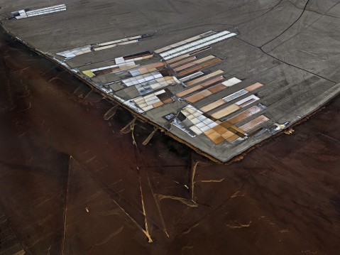 How do you see the Salt Flats series? Is it a chapter in a larger project?
I think its a stand alone series. In Salt Flats this is a pretty benign effect we are having on the landscape – if is stopped within a decade you would never know anyone was ever there. I’m working on the anthropocene but it doesn’t really fit as the things that we are looking at are those that will leave a signature in a million years. where were leaving evidence from plastics, concrete, glass, tunnels and so on.
How did you come to shoot the Salt Flats series?
I’ve known about these things for a few years and I kept thinking I’ve gotta go so I decided – go! I was doing work in Africa and I had a window of 10 days between two shoots and so planned this shoot. I did about 4 flights. It’s a military zone so its very hard and took an lot of angling to get unlimited flying in their area. I was able to shoot on the ground but it wasn’t nearly as interesting. For me it was a visual exploration of this space. My work has never really been on that documentary level so I would not do a story on the people on their plight – this is about how we as humans extract resources. So it’s following from that sort of work, whether its mines, quarries, agriculture, salt – so its in that category.
 They are very abstract images. I think a lot of Paul Klee.
I love Paul Klee and was thinking Paul Klee in this! The subject allowed for this abstraction and I’ve always been interested in it. With my Water series in particular it allowed me to look at abstraction in a way that other subjects didn’t allow. With water when i first started in 2008 I rented an 80ft bucket and I realised very quickly that to understand the scale at which we start to reshape the landscape a bucket wasn’t enough. It didn’t tell the story so you had to get up 600/800 feet to to see the irrigation shaping the desert.You can sit on the ground and see the irrigation and farms but it doesn’t read as well as at 1000 feet – from that perspective you really understand. The subject matter pushed me up. When I’m up there I’m always always interested in abstraction and abstract expressionism and all-overness
Are you worried that these images just become viewed just like abstracts and any environmental angle gets lost?
These are pretty benign. With the Salt Pans I don’t think there is a great environmental message and I’m happy for people just to view them as they like. They are just whimsical.
Salt Pans and Essential Elements are showing at Flowers Gallery until 29 October 2016
All images are © Edward Burtynsky 2016. Courtesy Flowers Gallery, London / Nicholas Metivier Gallery, Toronto.
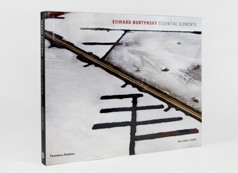
Edward Burtynsky: Essential Elements, edited and curated by William A. Ewing is published by Thames & Hudson, 15 September 2016, £45.00 hardback (www.thamesandhudson.com);
100 Works Of Art That Will Define Our Age – Kelly Grovier
24 February 2016 § Leave a comment
 This post is also published on CELLOPHANELAND* (link here)
I am usually rather sceptical about anything featuring numbered selections. Nowadays hardly anything seems to reach the pages of a magazine or a TV screen without being reduced to a seemingly arbitrary list. At best it can be of modest help where information has been distilled from something extensive or complex but at worst is simply a pointless exercise made with minimal critical judgement. The title of 100 Works Of Art That Will Define Our Age therefore aroused suspicion. How much selection was there? Was there really a nice round number? Could, or should, ’100’ just have been left off?

Numerical gripes aside this is an exceptional book. It is a formidable task to attempt to scroll forwards in time and make a judgement on how a future population will have judged art of the present day or indeed judge the art of your own era. It would also be easy to get bogged down in an almost endless series of semantic or philosophical questions but Grovier however delicately navigates this minefield with humour and skill.

He notes that Vincent Van Gogh’s contemporary view of his own ’Starry Night’ was that it was a dreadful ‘failure’ and by slipping in frequent insights such as this Grovier lets us glimpse at how the defining views of the art of the past and present are ever fluid.

We see how the artists of today continually draw from the past and how meanings flow in two directions. Great art never finishes but instead forever participates having the power to alter the art of the past as well as to influence the future.

Grover actually creates a definition of ‘Our Age’ by selecting art from about 1990 to 2010 leaving a certain amount of critical weight to have already been applied. The notorious Saatchi Sensation exhibition from 1997 already seems an age ago and a handful of works like Damien Hirst’s ‘Shark’ and Marc Quinn’s Self are naturally included. Many others like Olafur Eliasson’s Weather Project for the Tate Turbine Hall, Jeff Koons’ Puppy, Marina Abramovic The Artist is Present and Tracey Emin’s ‘Bed’ seem natural choices, neatly included in sections with titles like ‘Is All Art Nostalgic’ and ‘Can Art and Life ever be in Sync?’.

At the same time one does wonder whether the likes of Jeff Wall, Cristina Iglesias, Walid Raad, Sean Scully and Sheela Gowda really define our age. I dont think so, and it is a stretch to think that as many as a hundred works can possibly define an age. If we look back another thirty years to Pop art how far do we see beyond a handful of names like say, Warhol and Lichtenstein? Who knows even if the period 1990 to 2010 will ever make its mark on history or fade in to a forgotten mist?

However, as one progressed through the book, the pleasure in looking back at some of the great works of our era and reading Grovier’s beautifully written and insightful analyses will dissolve all doubts. It reads easily and gently expands our appreciation of works that we perhaps doubted or misunderstood. It may, or may not, in the end include the works that define our age but perhaps it is best viewed simply as an exemplary record of memorable recent art.
For more information visit www.thamesandhudson.com
Art Visionaries by Mark Gertlein & Annabelle Howard
13 January 2016 § Leave a comment
This post is also published at CELLOPHANELAND* (link here)
Art Visionaries is the latest publication from Laurence King Publishing, specialists in publications on the creative arts. This handsome and substantial softcover carefully lists seventy five of the ‘most influential figures in the history of art’ with an admirable clarity. Each artist is introduced on a double spread with a full page illustration of a key work and then a few hundred words that attempts to explain both their significance and artistic lives.
 The copy is well written and one can only admire the self control and skill required to abstract the life of say, Picasso, in to such a brief and highly readable summary. The writers manage to include snippets of interest and plenty of snappy quotes, useful even for those who may feel that they already know these artists well. “Nobody can own this project, nobody can buy the project, nobody can possess the project or charge for tickets” stated Christo & Jean-Claude, whilst Kasimir Malevich observed “I have dragged myself out of the rubbish pool of academic art“.
A further double page spread illustrates more key works with a useful graphic artistic timeline. The extra illustrated pages allocated to each artist are nice but perhaps a double-edged sword. Whilst allowing images of more than one key work it still cuts short a deeper analysis. As an example Gerhard Richter, not unusual as an artist who went through a number of styles in his lifetime, does not get any of his abstract works featured.
 Although it is not immediately clear from either the cover, this is a list of 20th century artists. There is also an almost total absence of artists from China, Africa, Asia and Oceania, along with Native and Folk artists and, although not stated anywhere, this volume therefore represents ’western art’ only. Fine, but really this should be clear in the cover notes or introduction.
To me there was a bias towards American artists and with the exception of Frida Kahlo, Nam Jun Paik, Yayoi Kusama, Mona Hatoum and Gabriel Orozco the remaining entries being Western European and Russian. The Brits do not do so well either – Henry Moore, Francis Bacon and Andy Goldsworthy are the only ones other than Hirst and Whiteread in who make it in.
 There were some tough choices at either end of the century. Gaugin & Cezanne for example probably died too early in the 20th century to deserve entry but it is harder with those like Munch, who was a key influence for the Fauvists, exhibited with them and worked until his death in 1944 but perhaps harshly does not find himself included. At the end of the century had the artists working in the 1990’s yet done enough?
 It is of course a thankless task to condense a roll call of thousands down to any sort of ‘popularity contest’ and everyone will find some of their favourites excluded and will disagree with some of those included. There are difficult choices, Italian Futurist Filippo Marinetti is featured but Vorticist Wyndham Lewis misses out. Unforgivably Max Ernst doesn’t feature and neither do Man Ray, Kurt Schwitters or John Baldessari – all true visionaries, whilst a number of mediocre but worthy artists are included. Personally I could have done without Rachel Whiteread, Mona Hatoum, Anish Kapoor, Jeff Wall and Sophie Calle. Richard Long is surely better than Andy Goldsworthy and aren’t other Arte Povera artists more deserving than Alighiero Boetti.
 Interestingly, other than on the cover there is no mention of ’Visionaries’. This is quite a powerful word and implies rather more than a list of big name artists from a specific era. A typical relevant definition is ‘a person with the ability to imagine how a country, society, industry etc will develop in the future’. If that was the case with any of the included artists it was neither evident or elucidated by the text. Despite discovering the fact that the book is actually part of the publishers ‘Visionaries‘ series (Architects, Design, Photography etc that are strangely not mentioned anywhere in the book) the impression is left that the title does not represent any sort of driving force behind the selection process.

Even if Art Visionaries could have been something more – perhaps a more detailed analysis of those artists like Picasso, Duchamp and Beuys who could have been perhaps considered as most ‘visionary’ – this is nevertheless an excellent, highly enjoyable and nicely designed volume well worth a place on your bookshelf.
For more information visit Laurence King Publishing
30,000 Years of Art – Phaidon
9 January 2016 § Leave a comment
This post is also published at CELLOPHANELAND* (link here)
Our historic – and largely still current – curatorial approach to archaeological and artistic objects has been to divide and classify, to separate and categorise. This has its advantages, but those institutions like the Pitt Rivers Museum in Oxford where form is privileged over origin, and Tate Modern where there is a thematic approach, show that alternative strategies can be worthwhile.
By listing artworks without prejudice to civilisations, geographical location, art movements or other artificial categories it takes away the inherent divisiveness of categorisation to allow some remarkable comparisons and invites us to consider links where we had not seen them previously.

30,000 Years of Art does note a basic classification, e.g. Post-impressionism or Nasca Culture plus a geographical location, but these play second fiddle to a straightforward chronological listing. We therefore find that sharing double page spreads may be Arabic scripts and Chinese brush paintings, the Venus de Milo and a Mayan mural or a Mexican mask and an Ethiopian stele.
It is in this removal of all art historical classifications and hierarchies that to us is 30,000 Years of Art main achievement. By presenting a thousand masterworks in chronological order it shows what was being created all over the globe at approximately the same time.
The result is a remarkable insight into the interrelationships between seemingly unrelated cultures and civilisations as well as celebrating the diversity between those that may be considered similar. The resulting timeline of works leads to compelling browsing with the juxtapositions offering intellectual pleasure and a sense of wonder and discovery.

This is a book that can be a real coffee table book to be dipped in to and enjoyed at leisure, the entries simply and clearly written and easily understood. It can be usefully read chronologically or utilised as a vital reference book taking the reader on a global and historical journey, as a Chinese Shang urn stands next to a Mycenaean vase, and Michelangelo’s Slave is followed by a contemporaneous male sculpture from Nigeria.

As a research or reference book it would also be useful alongside more comprehensive texts with the arrangement responding to such questions as what were artists creating in China or Africa while Rembrandt was painting self-portraits in Leyden? How were similar subjects – the female form, landscapes, religious scenes – manipulated by artists in Han China or Medieval Europe?
Although the sequence is chronological, the selection of entries for an individual culture comprises an abbreviated history of the art of that people. Thus, while artworks from ancient Greece or the European Renaissance or pre-Columbian Americas are interspersed with contemporaneous works created in Africa, India or Japan, an extraction of the Greek or Renaissance or American works could stand alone as an essential summary of the finest art of that period or culture.


This is a volume that will deserve repeated use and surely is a compelling addition to any collection – or coffee table. Highly recommended.
For more information visit www.phaidon.com
- 30,0000 Years of Art
- Phaidon
- Hardback
- 297 x 297 mm, 11 3/4 x 11 3/4 in
- 1064 pp
- 1,000 colour illustrations
- ISBN-13: 9780714847894
Best Album Art – Art Vinyl Awards 2015
9 January 2016 § Leave a comment
This post also appears on CELLOPHANELAND* arts and culture online magazine. Link here.
One of the most unfortunate aspects of the decline of the album, and to some extents the CD, has been the loss of the potential space for sleeve artwork. With the rise of vinyl sales during the last century, the artistic potential of the sleeves was not lost on the very best artists and photographers of the period, and many became involved contributing to a very memorable, if narrow, artistic genre.

Remember the great original Warhol covers for the Stones’ zippered Sticky Fingers and the banana for The Velvet Underground & Nico? The Beatles were of course involved too, with the Peter Blake photograph (not a collage by the way) for Sgt Peppers.

The Beatles drew in other Pop artists – Richard Hamilton made his minimalist statement for the ‘White Album’ whilst for David Bowie, Derek Boshier created the striking Lodger designs.

Top photographers were there too. Robert Mapplethorpe’s image of Patti Smith provided the iconic cover for Horses, Richard Avedon took Simon & Garfunkel’s picture for Bookends and – here’s a little known nugget – Man Ray created a photo collage for Exile on Main Street (below), sadly unused.

This is to barely touch the surface of the phenomenon of album art, something that we thought had gone forever with the apparent demise of vinyl in the 1990’s. Fortunately the death of the album had been greatly exaggerated and sales are now booming again.

With this resurgence comes a new generation of album artists, designers, prize and inevitably, an awards ceremony. Art Vinyl have a competition that is actually now in its 10th year, with this year’s fifty nominations selected by a panel of music design experts and previous Best Art Vinyl Award winners. In co-operation with Belgraves Hotel they have just revealed the 2015 winners.

David Gilmour’s ‘Rattle That Lock’ album took the top prize with Drenge’s ‘Undertow’ second, and Tame Impala’s ‘Currents’ third. The winners and all of the shortlisted entries are now on display in the window at Belgraves until the end of April.


The artwork covered a wide range of creative disciplines, including fine art, photography, sculpture and computer graphics. Given the august history of album artwork we perhaps should not be surprised that the short list also included two Turner Prize nominees, Mark Wallinger and Jim Lambie (for Linden).

David Gilmour’s wining cover was created by The Creative Corporation, in collaboration with Aubrey Powell from the legendary Hipgnosis – a design studio that produced covers for the likes of Pink Floyd, Led Zeppelin and T Rex.

Petite Noire – La Vie Est Belle
Best Art Vinyl founder Andrew Heeps explains, “This is the first year such an established artist’s record has won Best Art Vinyl, but notably the design team have historically been responsible for so many iconic sleeve designs… It’s interesting that two of the top three are conceptual compositions, using photography as the core of the design.”

Bjork – Vulnicura
In January 2016, the winners of the Best Art Vinyl 2015 award will feature in exhibitions in London, Scotland, Italy, Germany and Hungary as well as on www.artvinyl.com.
You can check out the entries on www.artvinyl.com or visit the window installation at the Belgraves Hotel, London Belgravia from 7th Jan 2016
For more information and the 50 nominated Best Art Vinyl 2015 records with designer credits see Artvinyl.com
Noemie Goudal: Southern Light Stations – The Photographers Gallery
7 January 2016 § Leave a comment
This post is also featured on the online cultural magazine CELLOPHANELAND* – www.cellophaneland.com
Photography has since its invention been primarily seen as a medium which reproduces reality, albeit more or less honestly. There are of course many photographers who are still documenting reality, and in the digital age these resulting images have an ever increasing shape-shifting flexibility transferring with ever-greater ease from the camera to the screen, internet, print, photo-book, advertising hoardings and even T shirts or mugs.

There is however an increasing movement of younger photographers who seek to deconstruct, alter and redefine the medium by foregrounding such formal aspects its physical form and the chemical or technical processes involved. Grouped loosely under the term ‘constructed photography’, the work of artists such as Matt Lipps, Walead Beshty, Daniel Gordon and Antonio Marguet makes the scaffolding of the photograph explicit whilst re-building photography as both a physical and technical art.

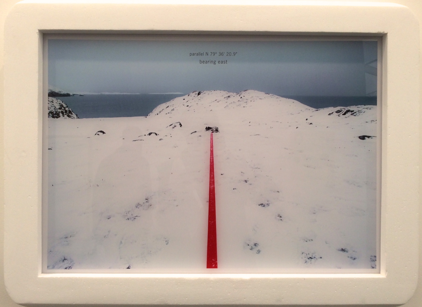
Noemie Goudal is one of the latest wave of these photographers having only graduated from the RCA as recently as 2012. Our attention was originally drawn to her work in an excellent High House Gallery group exhibition Re:Vision at 44AD in Bath and it is a significant comment on her talent that after such a short time The Photographers Gallery has given her a solo exhibition.
Southern Light Stations continues Goudal’s interest in man made interventions within the natural world. Her practice is to use props, large photographs or constructed photographic sets and rephotograph them within natural settings or other existing backdrops. For one set of images she looks at historic celestial and solar perceptions – the sky once being considered for example as a solid plane. Roughly built circular forms are hung within landscapes, their theatricality clear to see, and photographed.

Reflecting a fascination with our relationship to the sky, the exhibition draws upon a rich history of myths, legends, religious symbolism and early scientific theories. Through photographs, stereoscopes and architectural installations, the exhibition aims to explore the intangible nature of celestial space – long considered a mirror of terrestrial turmoil as well as an expression of the sacred.

For another series of architectural objects Goudal has digitally manipulated images of concrete buildings before affixing the collaged prints on to wooden constructions. These are then placed within barren landscapes or seascapes and again rephotographed.

Moving a work in to position
Both series draw upon the work of Bernd and Hilla Becher, highly influential German deadpan photographers – who documented German Industrial architecture with multiple images of similar objects such as water towers. Goudal’s work nevertheless adds to their work, is thought-provoking and fascinating.

NOÉMIE GOUDAL: SOUTHERN LIGHT STATIONS The Photographers Gallery, London until 10 January 2016.
For more information visit www.thephotographersgallery.org.uk
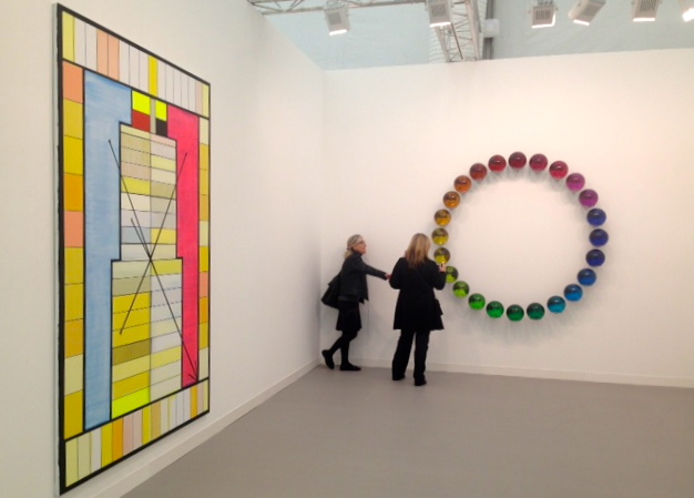
Frieze London
18 November 2015 § Leave a comment
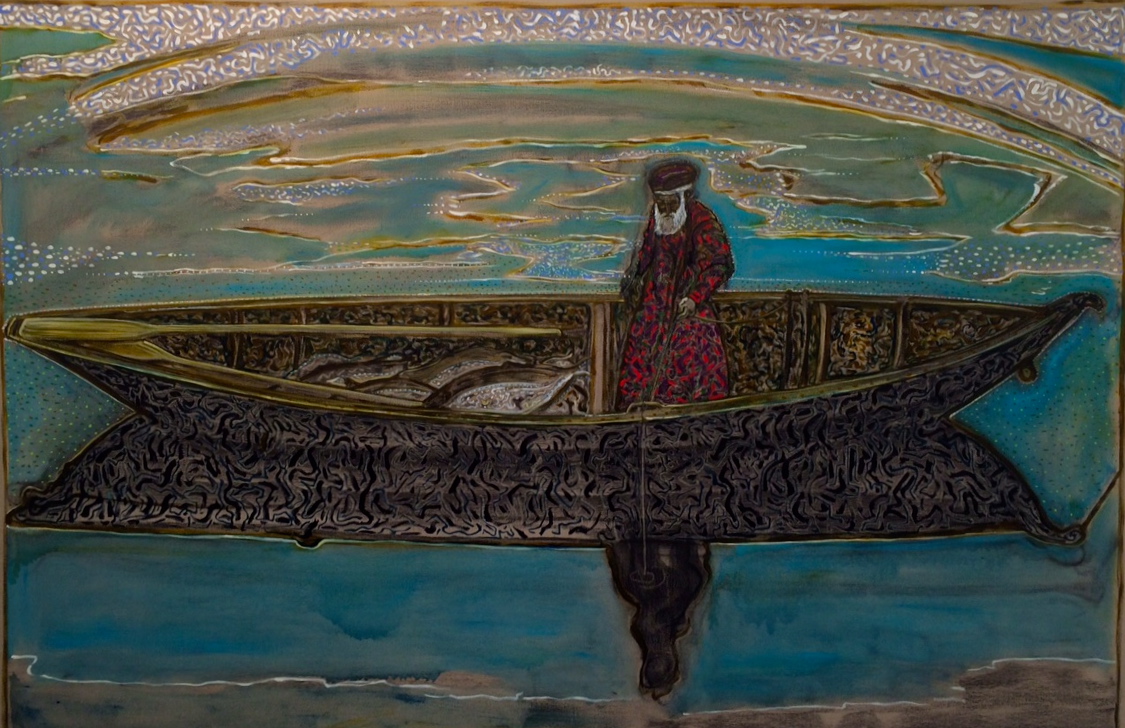
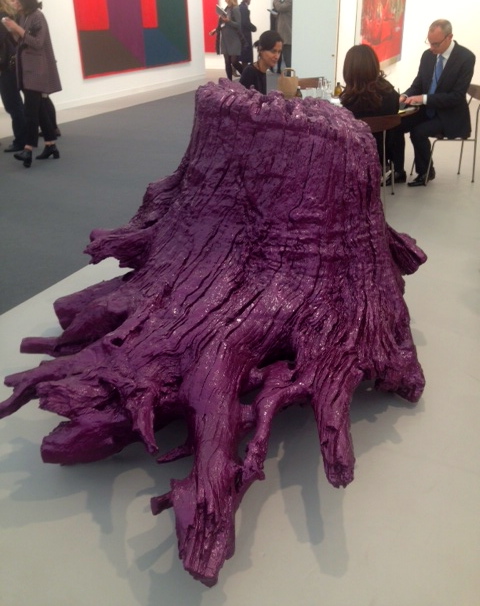
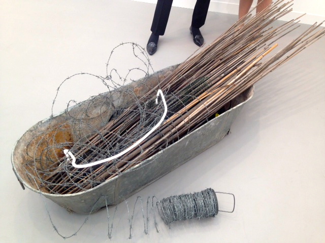
The preview day of Frieze always provides plenty of visual stimulation – both on and off the exhibiting gallery walls. As we shimmied past the likes of Benedict Cumberbatch, Tom Hooper, Tommy Hilfiger and Valentino we made our way around the fair to see what was on offer this year.
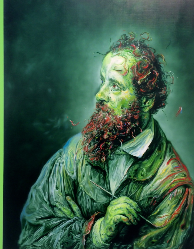
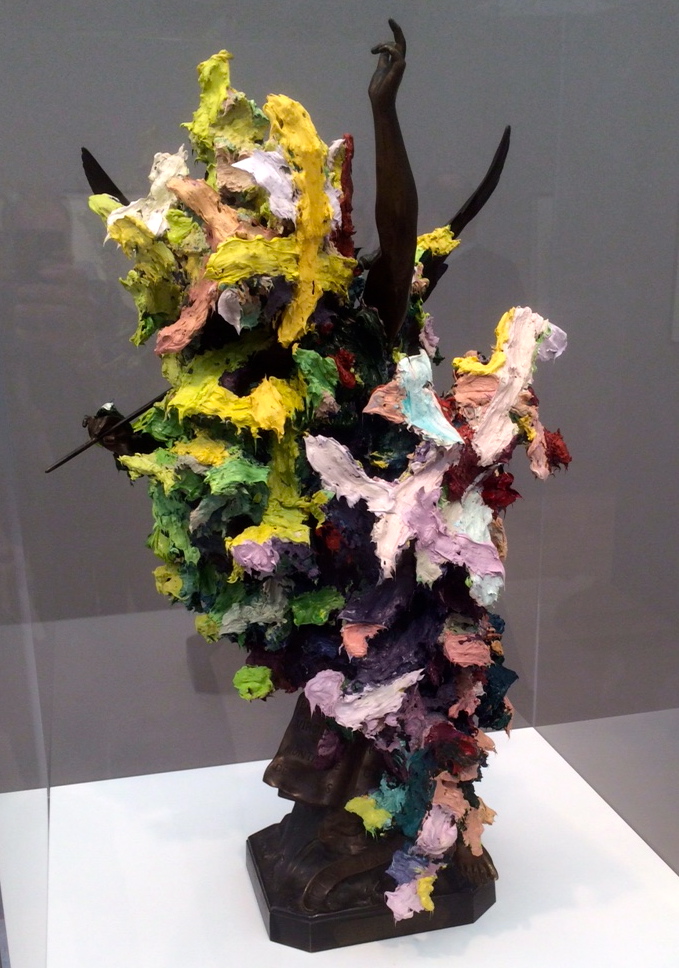
Glenn Brown was our undisputed favourite this year with a stand full of great pieces at Gagosian, including these examples of both oil and sculpture.
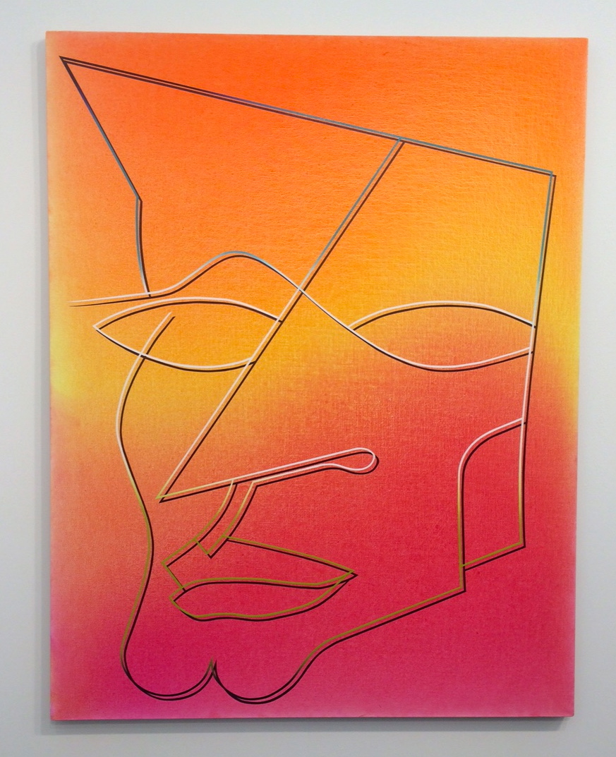
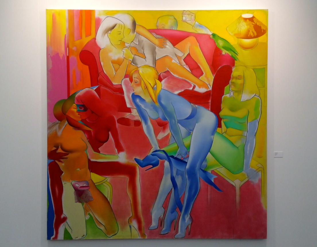
The young sensation Eddie Peake had two stunning works on show.
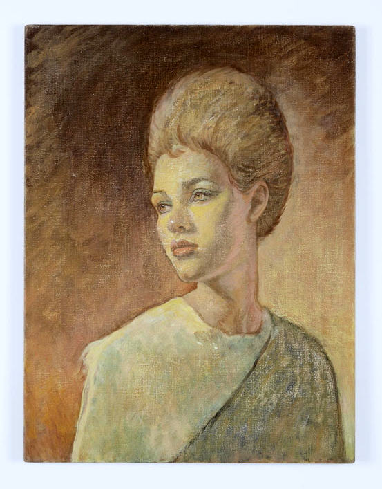 There were two superb Michael Fullerton portraits showing at the Carl Freedman Gallery.
The underrated Billy Childish had a large scale work, also at Carl Freedman.
A colourful large scale Allen Jones was a great example of his work.
Ai Weiwei has been dying his roots.
Self Portrait in bath by Tracey Emin underwhelmed us, but here are some others that drew our attention:

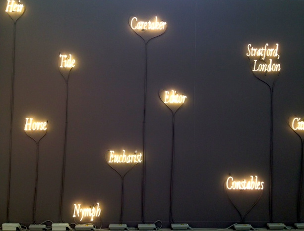
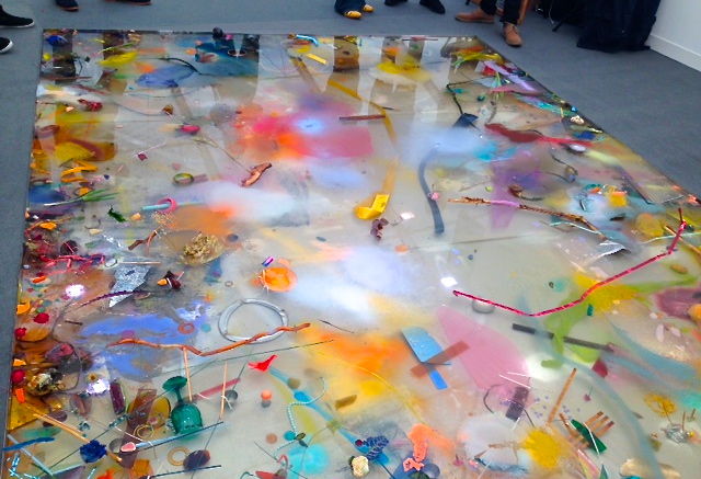
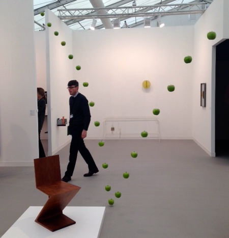
Frieze London runs until Saturday 17 October 2015. For more information visit www. friezelondon.com
For more information visit www. friezemasters.com
Images by CELLOPHANELAND* and courtesy of Frieze
Legend Of The East End, Bethnal Green, London
9 November 2015 § Leave a comment
Organised to anticipate the release of the film, Legend, on the 9 September, this exhibition offers a fine photographic overview of the world of the Kray twins.

The film itself is the latest take on the story of the Krays, and features a brilliant performance by Tom Hardy who bravely takes on the roles of both twins.
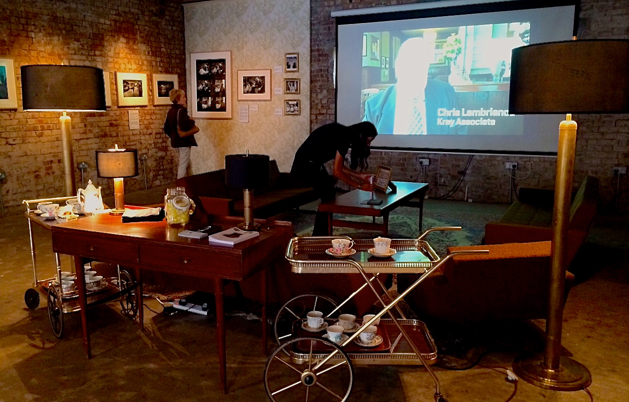
The Kray’s living room set from the film has been transported to the exhibition space. It acts as a sixties style viewing area for a short, looped documentary that hears from some notable characters from that period.
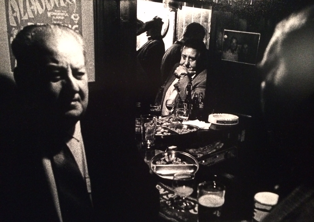
Duffy Archive
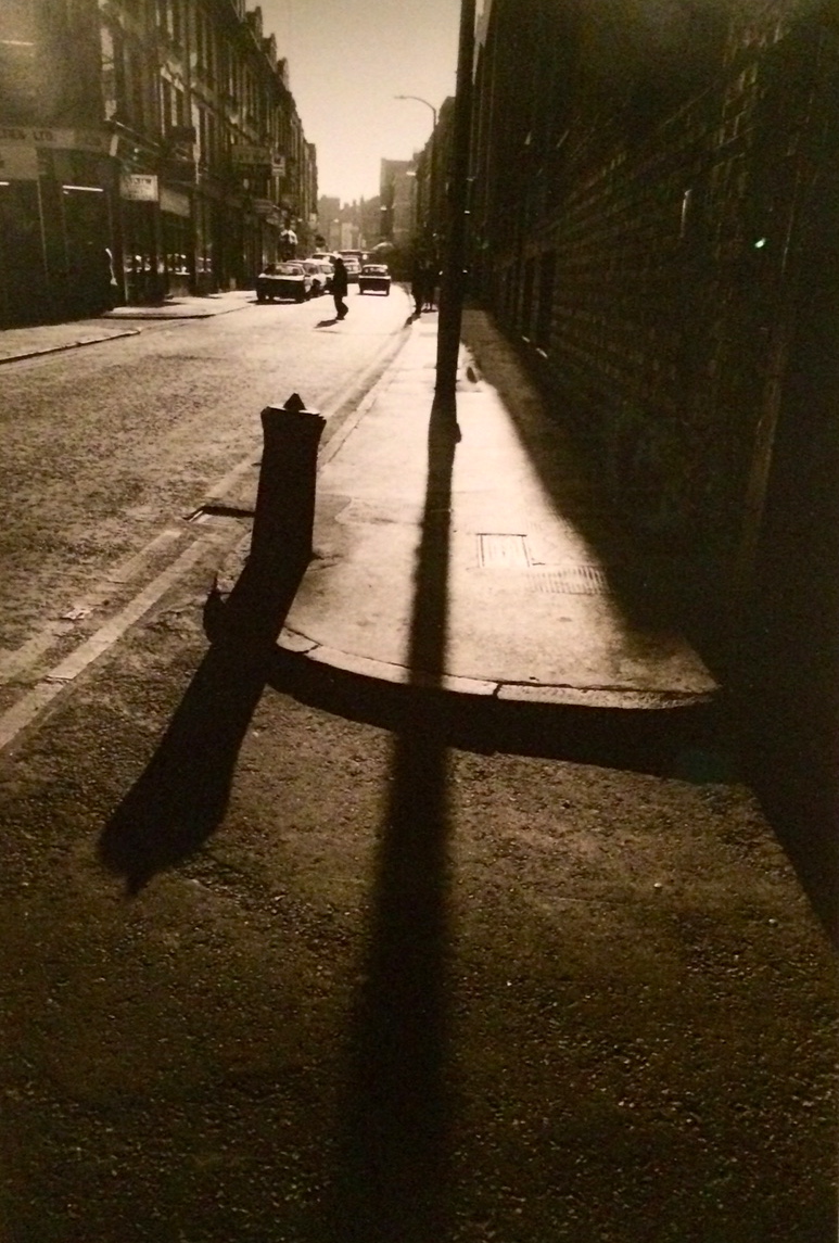
Along the walls are images from a number of top photographers. The renowned war photographer, Don McCullin, who visited the area for over twenty years from the 1960’s onwards, provides some notable images in his confrontational style.
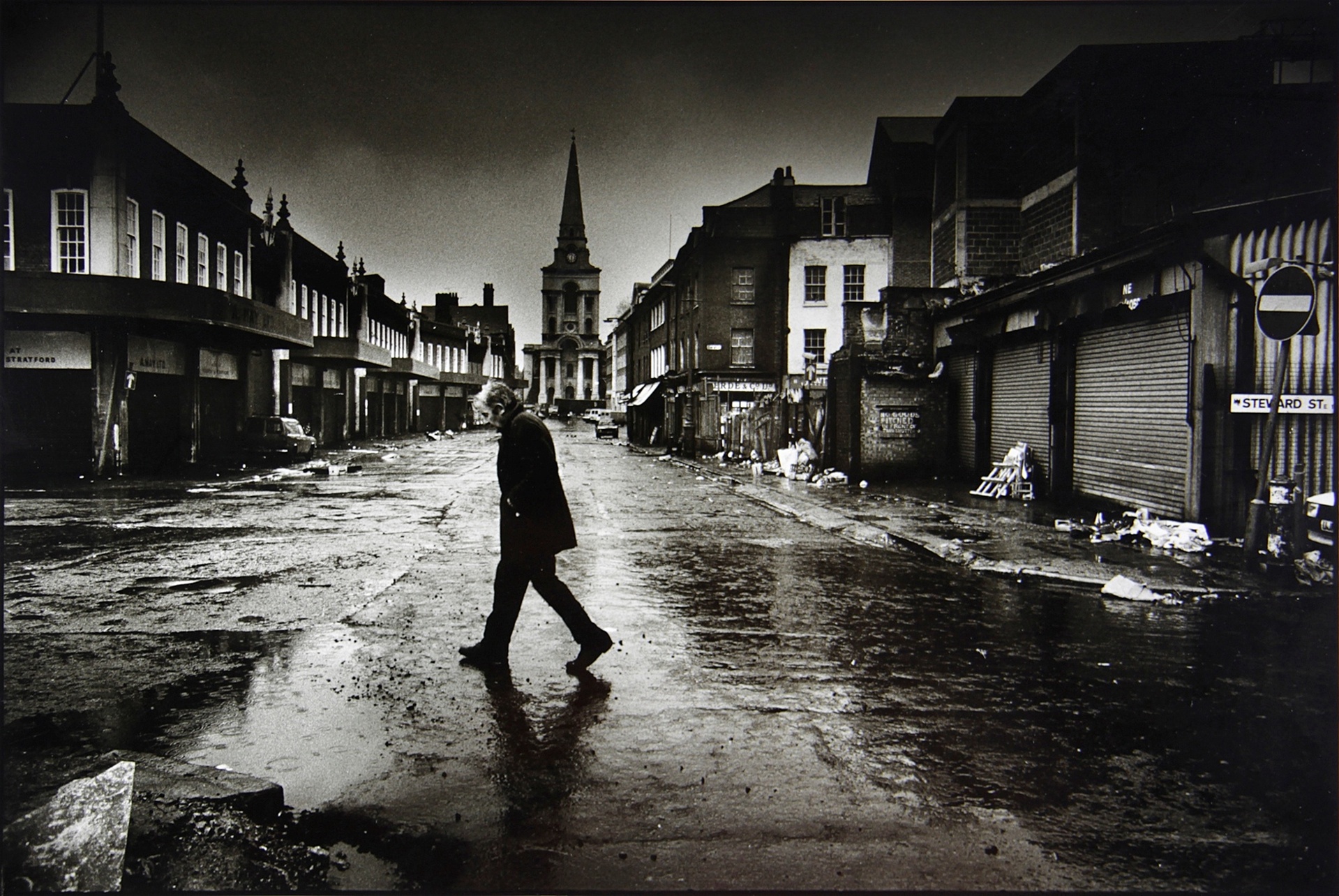
Don McCullin/the East End Archive at the Cass
McCullin captured the “suffering, drama and misery” of what he termed the “social wars” of this part of the city.
Also included are pictures by the equally celebrated photographer, Brian Duffy, a contemporary of David Bailey.
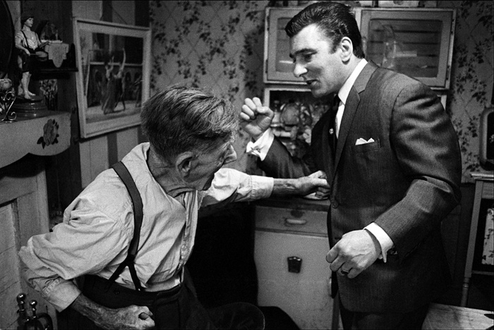
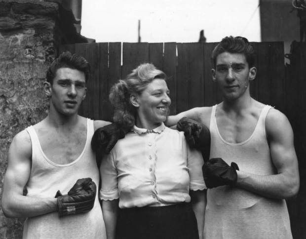
One particular picture shows Reggie sparring with his grandfather, Jimmy “Cannonball” Lee, who introduced the twins to boxing when they were children. Many more of his pictures of the twins were sadly lost when he destroyed much of his archive.
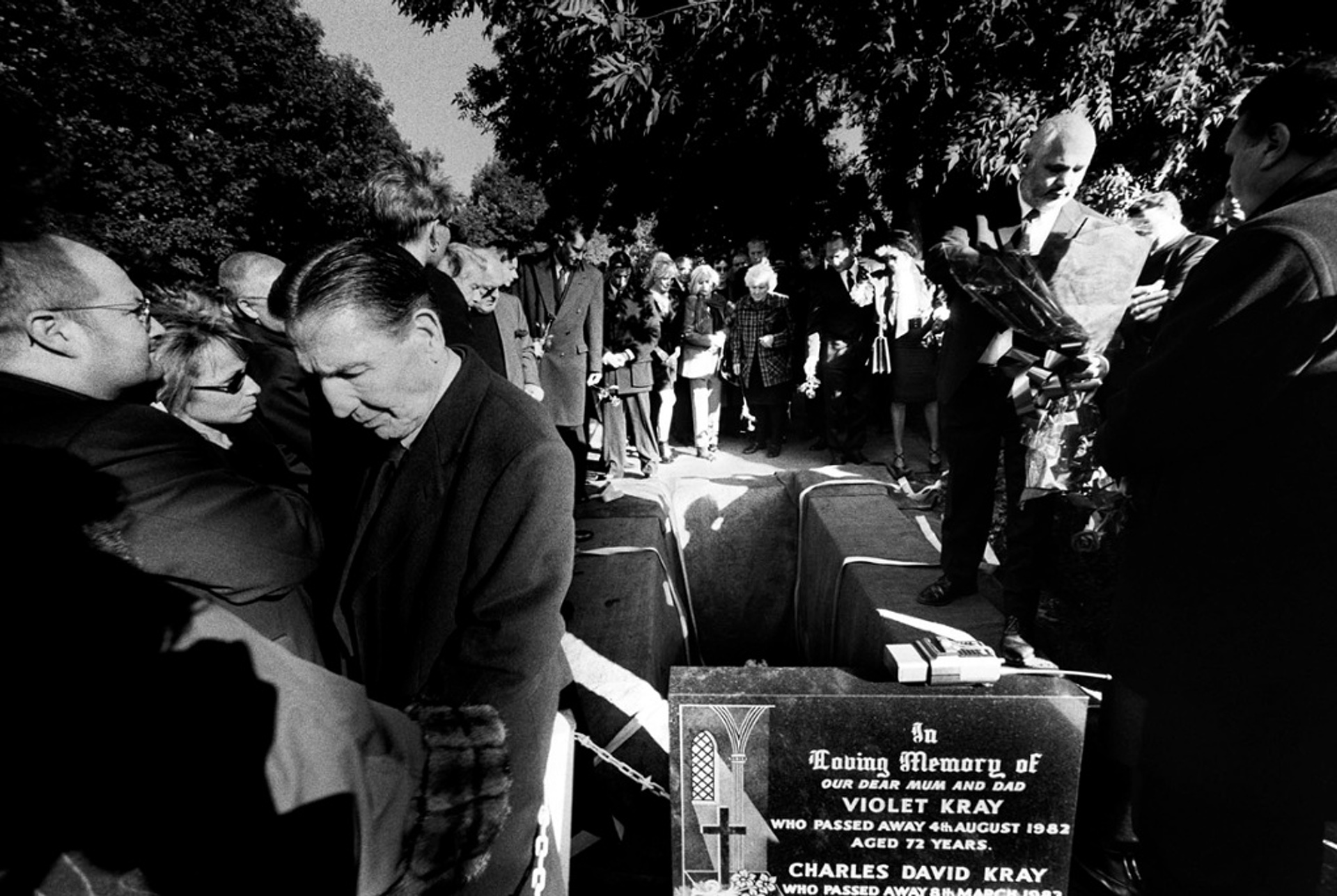
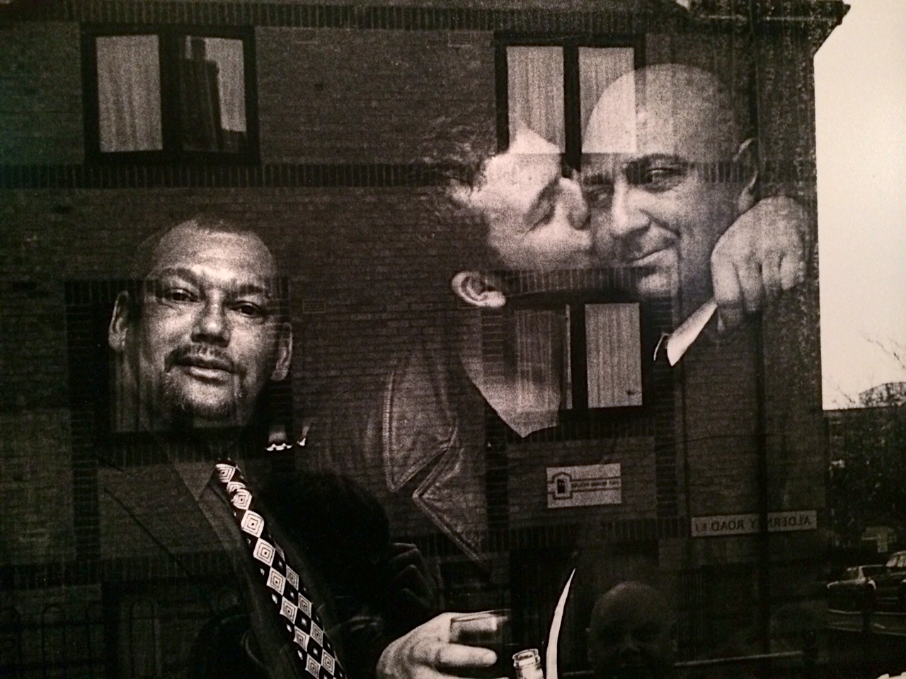
Jocelyn Bain Hogg
Other photographers exhibited include David George who spent thirty years taking photographs of the East End, and Jocelyn Bain Hogg, a documentary photographer who is also the author of five books including The Firm: a portrayal of criminal life from which the exhibited images are drawn.
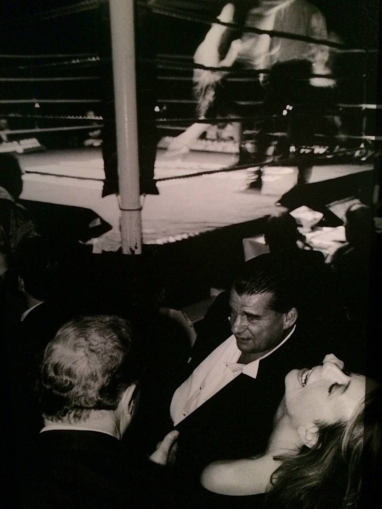
This excellent exhibition acts not only as a look at the Krays themselves but at the East End of London at the time and features the highest quality documentary photography.
Curator Zelda Cheatle says: “What I was conscious to do was not the clichéd thing to glamorise violence or make out the East End to be a terrible place full of violence. What I really hope is some of the joy and desire for life in the streets comes through.”
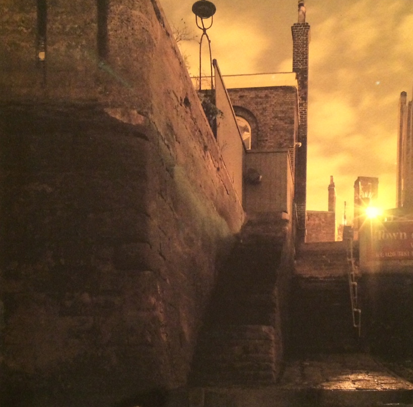
“The exhibition looks at the East End of the 60’s and 70’s, brought to life by the people who lived there, the photographers who captured everyday life, the undercurrents that continue to exist, and importantly it reflects the poetry of the streets. ”
Fox Photos/Getty Images
The Legend Of The East End runs until 11 Sept 2015 at 135 Bethnal Green Road, London, E2 7DG
For further info, visit: http://www.visitlondon.com/legend
Images courtesy Cass Archive, Duffy Images, Getty Images
