Steve McQueen – Tate Modern, London
5 March 2020 § Leave a comment
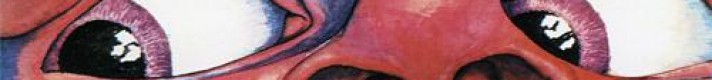
Steve McQueen is now familiar to us for his critically acclaimed films for cinematic release; most specifically the Oscar-winning 12 Years a Slave (2013) but he has also made Hunger (2008), Shame (2010) and Widows (2018).

Less widely known, was that well before this, McQueen was a highly regarded visual artist, winning the Turner Prize in 1999. It is this side of his output that brings McQueen to the Tate Modern in an exhibition that features 14 major works spanning film, photography and sculpture.

This is the first survey of his work in the UK for over 20 years, offering a timely opportunity to experience the depth of McQueen’s visual art career in this country for the very first time.
The single sculpture is Weight 2016, a forgettable sculpture first exhibited at the recently closed Reading Gaol. Presenting a gold-plated mosquito net draped over one of the prison’s metal bed-frames to create a shimmering apparition. Weight unsuccessfully ’explores the relation between protection and confinement, the physical and the spiritual’.

Much more interesting are his films, which vary in duration from a few minutes to over 5 hours. They also vary in presentation; some shown in darkened rooms by timed entrance, others on huge projected screens, and yet more on grainy super 8 projected on to the walls.

What all the works in Tate Modern share, are a powerful determination to show life as it is. The human body, including the artists own, are filmed in unflinching detail. As and when required we are exposed to unconfortable intimacy, extreme physical duress, emotional and psychological pressure, all filmed with an often uncomfortable sense of proximity and engagement.
Despite reflecting output over some 25 years, the films are not arranged in any chronological order, and there is tacit encouragement to take in the films in any order in the open plan arrangement of the gallery exhibits as well as to re-view and re-examine them. There are unfortunately significant gaps such as the pre-1999 works created for the Turner Prize and many recent works, but the exhibition nevertheless spans the artists practice well.

One of the first works encountered is Once Upon a Time (2002), replaying the bizarre images sent in to space by NASA in 1977 reflecting a utopian world strangely free of poverty, disease and conflict accompanied by an unintelligible invented language.

Alongside is Static (2009), a deliberately un-static and disorienting close-up portrait of the Statue of Liberty filmed from a moving helicopter.

In the red-tinted short Charlotte (2004) the actress Charlotte Rampling has her eye pushed and prodded by the artist whilst, shown opposite in Cold Breath, McQueen does the same to his own nipple first gently and then with unexpected violence.

The film installation Ashes shows a two-sided story on two sides of a screen. One side is a joyful ride on a fishing boat bobbing in the sunny Caribbean, the other features preparations for a funeral. Ashes, the male subject was sadly caught up in a deadly drugs deal.

The black singer and activist Paul Robeson, or more specifically the record of his 30 year FBI surveillance, is the subject of the mediocre End Credits. Secret documents run on the screen for an unwatchable 5 hours with a deadpan commentary listing all the redactions.

The masterpiece of the exhibition is undoubtedly the dark and intensely claustrophobic Western Deep (2002) – a journey down in to the world’s deepest gold mine. From the start we are plunged into intense darkness with just overbearing sound of the rattling mineshaft lift. In grainy Super 8 faces flicker in and out of the picture before the cage arrives deep underground.
We smell the sweat and feel the heat as the miners labour in the roar of heavy machinery. Sometimes there are sudden silences or bright lights, each as uncomfortable as the intense darkness or unbearable noise. We cannot help but be transported into the daily working hell of the miners. It is a shocking and visceral experience.

McQueen’s work does not always succeed quite enough to engage us in a gallery setting, however you cannot question the commitment of the artist to his expression of the often harsh and troubling realities of life, and the revelations of inequality, untruth or injustice. Even if only part of the exhibition hits home, it is nevertheless essential viewing.
Steve McQueen is at Tate Modern London, until 11 May 2020
Also published on www.cellophaneland.com
For more information visit Tate Modern
America’s Cool Modernism – the Ashmolean Museum, Oxford
7 November 2018 § Leave a comment
Most histories of modern art in the USA seem to skip through the period after the Great War in Europe. It is easy to do, after all the huge burst in European art movements that occurred in the early part of the 20th Century had by then subsided. The war had split groups and killed artists with those surviving largely shocked and confused with the new world order, unsure of new directions.

In Europe, expressionism and surrealism became prominent but there has always seemed that there was less to grab the attention over the pond. In the USA the effect of the war was less profound but still notable. It began with the Roaring Twenties and the Jazz Age, to be quickly followed by the Depression in late twenties and thirties. We think of progress in technology, film and design, perhaps ‘art deco’, but what of art?
It is a welcome event therefore to see America’s Cool Modernism arriving at the Ashmolean. This is an exhibition that looks more closely at this period with for example early works by Georgia O’Keeffe, photographs by Alfred Stieglitz, Paul Strand and Edward Weston and cityscapes by Edward Hopper.

There are plenty of works that have never travelled to the UK and there is the opportunity to learn of pioneers of modern American art whose work is less well-known in the UK, particularly Charles Demuth and Charles Sheeler.
It is often an anxious look at the period made with a cool detachment and emotional restraint. It is a world where people are largely missing from observations of eerie and empty places. But is it lost of hope or inspiring of redemption?

Of course we have Edward Hopper. His Manhattan Bridge Loop (1928) has a gloomy atmosphere with a tiny, solitary pedestrian whose walking pace is at odds with the bridge’s traffic. The African American Jacob Lawrence shows the harsh experience of marginalised groups seeking a better life.
Similarly bleak is the art of George Ault. In New York Night No 2 (1921) we see a cold and inhuman Manhattan in a dreary fog.

But not all the art is angst ridden. There was an alternative and altogether more optimistic viewpoint. Demuth’s I Saw the Figure 5 in Gold (1928), was dedicated to the poet William Carlos Williams, and in more particularly to his poem The Great Figure: Among the rain, and lights, I saw the figure 5, in gold, on a red, firetruck … It consists of a giant, stylized ‘5’ painted in bold colours, evoking new styles of advertising and a remarkable anticipation of Pop Art.

Another stunning evocation of Pop is found in Stuart Davis’s painting Odol. This is Warhol’s Brillo and Campbell’s soup cans but painted nearly forty years earlier. Davis incorporated imagery from logos, commercial signage, and modern packaging. This is a sleek, streamlined ode to a bottle of mouthwash (he also painted Lucky Strike, a visual riff on a pack of cigarettes). His work is usually presented as simply visual ’synthetic cubism’ inspired by earlier modernist masters. We would give him more credit and suggest it is a far more knowing representation of – let’s just call it – ‘early pop’ culture.

There was great progress over this period in design, architecture and building techniques and the grand structures of this machine made world feature prominently. Skyscrapers and bridges are studies in geometry and cities sharp and modern. Louis Lozowick’s prints capture the energy with soaring buildings while Ralston Crawford and Sheeler depict the factories of industrial America as glorious new cathedrals.

Georgia O’Keeffe looks over rooftops and chimneys in East River from the Shelton Hotel. It is the epic and almost abstract American landscape, but instead of out in the desert she is in the heart of the city. With Black Abstraction (1919) she is even more abstract.

This is a distinctly American modernism when artists were trying to create a distinct visual language rooted in American landscape and tradition. We see here a cool restrained and pared-back aesthetic featuring smooth surfaces, pure lines and a lack of figures. The Ashmolean allows us to see the birth of a new distinctly American style in this tremendous exhibition.
America’s Cool Modernism: O’Keeffe to Hopper is at the Ashmolean Museum, Oxford until 22 July 2018
For more information visit www.ashmolean.org
Wim Wenders: Instant Stories – The Photographers Gallery, London
8 November 2017 § Leave a comment
Anyone familiar with the work of Wim Wenders may suspect that he has more than a passing interest in photography. In two of his movies in particular the use of Polaroid cameras is a vital part of the narrative: in the road movie Alice in the Cities there is a photo-obsessed protagonist whilst in The American Friend, Dennis Hopper snaps himself repeatedly. Both make appearances in the exhibition, the film clip of Hopper showing alongside multiple images taken during the period of filming.

It is not however necessary to have any knowledge of his films to enjoy this exhibition for Wenders is a fine photographer. He is reluctant to admit this, and wants the Polaroids to be enjoyed rather as illustrations of the period and a record of the people and places.

He says “I was learning the craft of filmmaking in those years, and Polaroids were the perfect complimentary tool: as a visual notebook, a quick way of ‘framing’ the world, a verification of my interest in people, places, objects, or simply as a way to remember things.”

Wenders was a prolific Polaroid user, so much so that the company would supply him with cameras and film to test. He himself estimates that he took more than 12,000 Polaroids between 1973 and 1983 although only 3,500 remain. “The thing is,” he says, “you gave them away. You had the person in front of you, whose picture you had just taken, and it was like they had more right to it. The Polaroids helped with making the movies, but they were not an aim in themselves. They were disposable.”

The images are wonderfully evocative. The are instinctive and clever. Sometimes they make clever use of colour and light at others there are moody black and white street scenes. He dips in an out of recognisable styles. In one a car door hangs loosely open, inviting us to complete a story perhaps. In another a pair of spectacles looks back at in front of a blurred cityscape.

There are moments of leisure – a casual image of a bottle of ketchup on a table is cleverly composed and invokes Martin Parr’s casual inspection on culture. An image of Dennis Hopper cigarette in hand is a perfect off-screen image of a celebrity. Stacks of Campbell’s Soup are clearly a reference to Andy Warhol.

Often they were his visual notebook – a way of testing out frames and ideas – but more than that they offered him a kind of liminal space between the subject and the photograph, the photographer and the act of taking a photo, the intention and the outcome.

He is also well aware of the place in photographic history of the Polaroid. “The entire Polaroid process has nothing to do with our contemporary experience, when we look at virtual and vanishing apparitions on a screen … This was a true THING, a singular object of its own, not a copy, not a print, not multipliable, not repeatable.”

Sadly it is now 30 years since Wenders took any Polaroids. “It’s not just the meaning of the image that has changed – the act of looking does not have the same meaning. Now, it’s about showing, sending and maybe remembering. It is no longer essentially about the image. The image for me was always linked to the idea of uniqueness… that whole notion is gone.”
Despite his insistence that this is ephemera not to be taken seriously, when displayed in a gallery and viewed as a body of work there is no doubt that these are important images and easily elevated to the status of ‘art’.

Wenders insists “The meaning of these Polaroids is not in the photos themselves – it is in the stories that lead to them. That’s why the exhibition is called Instant Stories – the catalogue is a storybook more than a photo book.” This is a ‘story’ that is absolutely essential viewing for any photographer or film maker whilst still being a rich and fascinating experience for everyone.
Instant Stories is at The Photographers’ Gallery, London until 11 February 2018
CELLOPHANELAND* were guests of The Photographers’ Gallery
Basquiat: Boom for Real – The Barbican Gallery, London
2 November 2017 § Leave a comment
Do not come to the latest Barbican Gallery exhibition Basquiat: Boom for Real expecting a straightforward show of Jean-Michel Basquiat’s work. This is rather more than that and all the better for it. This is an exhibition where, in the words of Jane Alison, the Barbican’s Head of Visual Arts, we can “see those works in the context of the New York scene of the 1980s.” We therefore get videos, photographs, music, film, books and paintings, where Basquiat is presented as a multidimensional artist weaving between media.

New York at that time was certainly a rich melting pot. A dangerous and violent city on the edge of bankruptcy, it housed a thriving cultural scene. Basquiat, young and black has often been pigeon-holed as a a poor outsider, who developed from homeless graffiti artist to gallery favourite. The truth is rather different.

From a relatively wealthy family, Basquiat went to a private school, was well educated and a talented artist and was admiring Renaissance masters in New York galleries in his teens. Having dropped out of college, he briefly ran away from home, stayed with friends and scrawled graffiti as ‘Samo’ (a play on ‘same old shit’), although its style was not ‘from the streets’ but always from an artist insider critiquing the contemporary art scene.

The Barbican Gallery divides the show in to some fourteen sections. From Samo graffiti we then see the beginning of his stratospheric rise in a recreation of the New York/New Wave exhibition. A landmark show where despite including the likes of Andy Warhol, Nan Goldin and Robert Mapplethorpe, the young Basquiat was singled out for admiration.

Between examples of his work we get to learn plenty about the post-punk underground art scene: The Canal Zone, a graffiti covered downtown loft/art space brought him together with collaborators for collage and postcards; the Mudd Club was where he hung out and performed with his band; at Area he hung out with Keith Haring or Madonna whilst dj-ing sets on a Brian Eno created sound system.

A key element of the exhibition is a remarkable film, Downtown 81, a chronicle of a day in the in the life of a down and out artist, for which Basquiat was chosen to play the leading role. It is essentially a prescient version of his real life as we see him spraying Samo-tagged graffiti and hawking his art (some of it in the show) around galleries as he visits clubs, watches bands and interacts with the larger than life local characters.

Glenn 1984 – Jean-Michel Basquiat
If so far we haven’t mentioned his art much, it is with good reason – there is not a lot here. We do see his graffiti, collages, postcards, sketches, polaroids and even his graffiti covered fridge. We also see books, records and photographs as the Barbican outlines his jazz, art and classical influences.

Jean Michel Basquiat – King Zulu 1986
Where we do see his larger works – vibrant, raw imagery, abounding with fragments of bold capitalised text – they offer insights into both his encyclopaedic interests and his experience as a young black artist with no formal training. New scholarship sheds light on some of his most acclaimed works – sampling from an extraordinary breadth of source material – anatomical drawings to bebop jazz to silent film.

Untitled (Pablo Picasso) 1984 – Jean-Michel Basquiat
“Untitled” (1981), for example, includes variations of the name Aaron. While Basquiat’s father understood it to be a reference to baseball player Hank Aaron, the Barbican Gallery posits other allusions: a character in Shakespeare’s play “Titus Andronicus,” and the brother of Moses in the Old Testament. Two letters also feature individually, “A” and “O,” and relate to a passage from Revelation that fascinated Basquiat: “I am Alpha and Omega, the beginning and the end.”

Jawbone of an Ass 1982 – Jean Michel Basquiat
The label for his 1982 painting Jawbone of an Ass, he lists historical figures including Hannibal, Machiavelli, Savonarola, Sappho and Rameses II, is a vision of world history as a ceaseless round of wars. Cartoon monsters with savage teeth express the violence of the painting’s Biblical title. In the bottom right, a black boxer hits a white opponent.

He worked surrounded by imagery: open books, pages from magazines and photographs laying around him as the TV flickered and jazz music played. He worked rapidly absorbing influences from anything and everything. Sometimes the resulting art is hard to like, at others remarkably fresh, powerful and multi-layered.

“Untitled” (1982) – Jean-Michel Basquiat
Strangely there is nothing here about his heroin addiction and untimely death at just 27, and we do not know if there were lost chances to save him from self-destruction. We are ultimately left to ponder what sort of art this talented and elemental force would have continued to produce if it were not for his tragic end.
Basquiat: Boom for Real is on at the Barbican Gallery in London until 28 January 2018.
All images © The Estate of Jean-Michel Basquiat, Licensed by Artestar, New York
Rachel Whiteread – Tate Britain
14 October 2017 § Leave a comment
Now that Frieze, Frieze Masters and the PAD art & design fair are packed up we can move our attention to what else is going on in London this month. October is always chock a block with inviting exhibitions it is hard to know what to recommend first.

The Tate Gallery seems a pretty good place to start where Tate Britain are currently presenting the most substantial retrospective survey to date of work by Rachel Whiteread.

The exhibition reveals the extraordinary breadth of her career over three decades, from the four early sculptures shown in her first solo show in 1988 to works made this year especially for Tate Britain including Chicken Shed, a new concrete sculpture installed outside the gallery.

It is particularly interesting to see the remarkable consistency of vision right from her work as a student at The Slade and up to the present day. The curator, Ann Gallagher has herself also noted “through consistency of process there is an incredible variation”.
Early works from her fist solo exhibition at the Carlile Gallery in 1988, just one year after her graduation include domestic objects like a wardrobe interior and underside of a bed.

From this point onwards we see the interests that define Whiteread’s ongoing practice – the process of casting forgotten space, with an experimental use of materials.
With ordinary, everyday objects she manages somehow to draw an unexpected emotional power. Each work managing to resonate with the history of human presence. A series of multi-coloured hot water bottle interiors cant help but bring to mind strange limbless and sculptural torsos.

Known for her signature casting technique, Whiteread’s work ranges in scale from the modest to the monumental in a variety of materials such as plaster, resin, rubber, concrete, metal and paper. Toilet roll tubes, furniture, windows, doors, rooms, stairwells and even libraries, all are prey to Whiteread’s attention.

The large spaces that Tate Britain have devoted to the exhibition allow us to gain some distance from the larger objects, whilst partitions allow places where there are more intimate groupings.

The centre of the room is dominated by a cast of ‘Room 101’ – a room in the old BBC Broadcasting House that may have inspired George Orwell. We not only see the large bulk and presence of the room but, moving closer, see the the fine details of the cracks, textures and marks on its internal wall.

Another monumental sculpture is of a large stairwell. From any angle it has an eerie familiarity as a stairwell such as one in an industrial spaces or concrete car park. However, of course it is the empty space that has been made solid – reminding us that it is our mental equivocation that brings a particular resonance to Whiteread’s work

Out in the expansive Duveen Gallery another highlight of the exhibition is Untitled (One Hundred Spaces) 1995 – a colourful installation of 100 resin casts of the underside of chairs.

Less impressive to us – but interesting to see nevertheless – were the special sections are also devoted to archive material and to the artist’s drawings. Working with pencil, varnish, correction fluid, watercolour and collage, these works on paper constitute a distinct area of Whiteread’s practice but do not have anything like the impact of her sculptural work.

On the way out be sure to see the internal cast of a chicken shed located in the gardens, an arresting sample of the remarkable visual power of Whiteread’s work as well as a reminder of the breathtaking cultural short-sightedness vandalism committed by Tower Hamlets council when they demolished ‘House’ in 1994.

The exhibition is co-organised with the National Gallery of Art, Washington, where it will be shown in autumn 2018, and will also tour to the 21er Haus Vienna and the Saint Louis Art Museum.
CELLOPHANELAND* were guests of the Tate Gallery
For more information visit www.tate.org.uk
Franco Grignani : Art As Design 1950-1990 – The Estorick Collection, London
10 September 2017 § Leave a comment
In a peaceful square in the heart of Islington the Estorick Collection is easily overlooked but well worth a detour. This is one of London’s most delightful and interesting smaller galleries. Featuring only Italian modern art it not only holds a regularly changing exhibition schedule but also houses one of the world’s finest collections of Italian Futurist work.

The collection was founded by American sociologist and writer Eric Estorick (1913–93), who began to collect art when he moved to the UK after WW2. Rejecting numerous offers he set up the Estorick Foundation, to which he donated all his Italian works.

Its premises at Northumberland Lodge were ironically blighted by traffic soon after construction in the early 19th century but now represents a delightful backwater in a busy part of London. There is a lovely cafe and garden and a bookshop alongside half a dozen elegant exhibition spaces.

Ever bought a woolly jumper? Then you will recognise the woolmark – one of the most enduring legacies of artist and designer Franco Grignani This was an artist who, in his younger days, was briefly affiliated with the futurist movement before turning toward geometric abstraction in 1935 when he opened a studio in Milan specialising in design and graphics.

Over the years he produced advertising campaigns for a variety of high-profile companies, including Pirelli and Alfieri & Lacroix, and designed covers for a number of science fiction novels published by Penguin Books.

Alongside such commercial work he continued to create paintings which revealed a growing fascination with optical effects. His ideas were not understood by the art establishment, and he worked largely in isolation creating pieces characterized by their use of blurred forms, and warped and dynamic ‘virtual’ shapes that seem to emerge out of, and recede back into, the surfaces of his compositions.

The exhibition focuses on his favoured black and white works. These are obvious precursors of Op Art and of course Bridget Riley, and Grignani must have been a huge influence on the movement.

The exhibition features a series of works that leave you stunned by the power of his creativity and imagination. It is a dizzying array of inventive and hypnotic optical effects – some are sharply angular whilst other more organic, perhaps twisting spiralling or intersecting.

Vitrines hold a display of penguin book covers and magazine work whilst wall hung work also includes those for commercial clients. As the exhibition subtitle suggests, this is a great reminder of how the border between powerful graphic design and fine art can overlap, shift and morph. An enlightening, impressive and dizzying exhibition.
Exhibition runs until 10 September 2017
For more information visit www.estorickcollection.com
The Polaroid Project: At the Intersection of Art and Technology ed. William Ewing and Barbara Hitchcock
4 July 2017 § Leave a comment
This post is also featured at www.cellophaneland.com
Remember that time, not so very long ago, when we all rushed down to the local Boots to drop in our films for printing? From this frustration of impatiently waiting anything from an hour (for those willing to stump up extra) to a week, to see the results of all the careful holiday snapping, lays the foundation of the Polaroid.

Back in 1943 Edwin Land, having been asked by his young daughter why she couldn’t see her photo right away, immediately set to work. Within an hour he had conceived the technology and the story of instant photography had begun.

The Polaroid Project Timothy White, Untitled 1998
When the long and painstaking development process (no pun intended), documented in the book by prototypes, models and test images, had been completed, the result was not only scientifically groundbreaking but also heralded a new chapter of artistic expression. The New York Times proclaimed “There is nothing like this in the history of photography…”

Nowadays Instagram is the leading representative of the world of instant imagery. It should therefore not be surprising to know that prominent in the lobby of their California HQ sits a collection of Polaroid cameras, the most noteworthy being the 1977 OneStep featuring the rainbow logo appropriated by Instagram in its own design.

Land had in the seventies already predicted escalating use of cameras saying that they would soon be used ‘All day long…. like a telephone’, whilst probably not anticipating they would often be one and the same apparatus.

Polaroid Project S. B. Walker, Blocked out Polaroid sign, 2011
In this lay the recognition that the world, and people, had irrevocably changed; the barrier of subject and photographer had started to disappear in line with Barthes ‘Death of the Author’ and there was a continuous recording of lifes events and expansion of the ‘sharing’ experience. The almost instant sharing of Instagram, Facebook and Snapchat seem to be a natural development of what began with the Polaroid.

Polaroid Project Dennis Hopper, Back Alley 1987
For the more artistic the new product was impressive but came with many built in limitations. Images were usually of limited size (save by using larger studio-bound cameras), fixed formats, limited camera adjustments. Laboratory colour and exposure manipulation were impossible.

Polaroid Project Barbara Crane, Private View, 1981
Despite, or perhaps because of, these very particular restrictions it invited users to become ever more inventive. Artists like Lucas Samaras and Bruce Charlesworth manipulated or separated the emulsion or used repeated exposures. David Hockey used multiple images overlaid or arranged in grids to increase dimensions. Other painted, drew or scratched on and around the developed image.

Polaroid Project Paolo Gioli, 2010
Andy Warhol took all his portraits with a Polaroid and incessantly snapped his way around New York, Others like Robert Mapplethorpe, Patti Smith, Robert Rauschenberg and Chuck Close often used it, whilst film makers, commercial, advertising and fashion photographers found the instant images essential for planning their shots.

Polaroid Project Toshio Shibata, Untitled (#228), 2003
It’s colour initially put off many art photographers, black and white being up to then the choice for ‘serious’ practitioners. This however was the era of ever more portable 35mm cameras and also of photographers like William Eggleston and Stephen Shore and Polaroid were in a perfect position to tap in to the wider acceptance of their casual colour snap-shot aesthetics.

Polaroid Project Mark Klett, Contemplating the view at Muley Point, Utah, 1994
The Polaroid Project leads us through this story via a series of essays that look for example at Polaroid’s foundation and history, the development of the technology, artistic developments and its relation to social networks and the selfie. They are interspersed with an impressive array of widely varied imagery with plenty of ‘how on earth did they do that?’ moments.

Polaroid Project Victor Landweber, Garbage Candy, 1979
The book is subtitled ‘At the intersection of Art and Technology’ and it is published to accompany a major touring exhibition, so it is not surprising to see that text and illustrations are geared towards the artistic. Perhaps a future show and accompanying volume can show what the public, as well as industry and business, created with the technology – but that’s yet another story.

Polaroid Project Ellen Carey, Pulls (CMY), 1997
There is a frequent lament here to the death of Polaroid, tied to the winding up of the company and closure of the factories, but, as with vinyl, this seems hugely premature. Instant film lives on in Fuji and Impossible, as does the use of Land’s cameras. The Polaroid Project itself shows us that interest in this technology and its uniquely ‘authentic’ aesthetic is increasing, whilst here at CELLOPHANELAND* we even have a couple of cameras of our own and Polaroids pinned on the wall. The king is dead – long live the king!
The Polaroid Project: At the Intersection of Art and Technology ed. William Ewing and Barbara Hitchcock, published by Thames & Hudson. To purchase (currently at a 20% discount) visit www.thamesandhudson.com
A touring exhibition organised by the Foundation for the Exhibition of Photography opens at the Amon Carter Museum, Fort Worth, Texas June 3 to 3 September 2017 then travels to Europe. fep-photo.org/exhibition/polaroid/
Magnum Manifesto edited by Clément Chéroux
1 July 2017 § Leave a comment
This post also appears on www.cellophaneland.com
Any history of photography would be incomplete without substantial mention of the famed photographic agency Magnum, now celebrating its 70th anniversary. Within its 1947 origins are both the reasons for its success and for its often rocky journey: the diverse founding group included both Robert Capa who represented the ultimate in involved photo-journalism and, at the opposite end of the spectrum Henri Cartier-Bresson whose imagery was detached and artistic. This stylistic inclusivity both made it important but at the same time ensured that members would rarely see eye to eye.

What they had in common however was a desire to break the traditional model of the photographic business – a system where the publishers had total control. Magnum Photos Inc sought to break this with a disruptive model worthy of Uber. The photographers would take control of their images, owning their rights, dictating editing and presentation and even creating content and photo-essays.

USA. 1968. Robert KENNEDY funeral train. © Paul Fusco/Magnum Photos
Despite the canny catch-all basis of the business – which included not only photographs but for example printing, cameras, moving images, design, studios, materials and equipment – image quality always remained high in the agenda. Magnum would always stand for intelligence in combining both reporter and artist in the photographer’s role.

GERMANY. West Berlin. Between the Brandenburg Gate and Potsdamer Platz. November 11th, 1989. A young man sits on the wall between East and West Berlin. © Raymond Depardon/Magnum Photos
The story to be told in the Magnum Manifesto therefore is formidably complex. It is one that includes the Magnum’s founding, its ever-changing membership, the business models, the personal relationships and the artistic and cultural events that shaped the whole. In an often uneasy amalgam, its constituent photographers were often in conflict and a steady intake of new members, carefully screened and slowly inducted, meant an organisation in continuous flux.

USA. New York City, NY. 2014. Cherries spilled on crosswalk. Christopher Anderson Magnum Manifesto reviewed on wwwcellophaneland.com
Over and above this are of course the photographs from a roll call of the best in the world in all fields – Capa, Cartier Bresson, Elliott Erwitt, Alec Both, Alex Webb, Eve Arnold and so on. Their archive is represented by a steady stream iconic and event-defining images. These not only represented what was happening in the world but often shaped public opinion and by doing so could be argued to have moulded future events.

AUSTRALIA. South Australia. Adelaide. West Lakes Shore. 2007 © Trent Parke/Magnum Photos
A deep look into the organisation is therefore so much more than a book of photographs and in fact the anniversary is being marked not just by this hugely impressive book, but by a global programme of events and exhibitions.

USA. NYC. 9/11/2001. People use masks made out of clothing to protect themselves from dust that is thick in the air after the collapse of the World Trade Center towers © Gilles Peress/Magnum Photo
The title Magnum Manifesto makes it clear that this is not just a photo book featuring their ‘greatest hits’ but a deeper look in to everything that it represents. The book infact takes the opportunity to display plenty of lesser known, but still impressive, works. After some introductory essays, the preface looks at the four founders at the time that they created the organisation – all working busily around the globe in a rapidly changing post war world – before dividing Magnum’s story in to three key periods.

USA. Illinois. Chicago. 1948. Strike captain during protest by the packing house workers, March 1948 © Wayne Miller/Magnum Photos
Human Rights and Wrongs represents the period from its founding until 1968. A time of widespread unrest it was also the time of the UN Declaration of Human Rights – a proclamation with the same values of liberty, equality and dignity espoused by the agency. We see representative images of hunger, postwar Soviet Union, black power, strikes and student riots before a series of longer photo essays that look at universality – a theme that at least partly inspired Edward Steichen’s landmark ‘Family of Man’ exhibition at MoMA in 1955, where nearly a fifth of the images were supplied by Magnum.

FRANCE. Normandy. 1947. Children play among the wreckage of the D Day invasion © David Seymour/Magnum Photos
An Inventory of Differences describes the subsequent period, from 1969 to ’89, where the focus became more on differences and otherness. We find the unemployed, deformed, immigrant, minority and marginalised of the world and memorable images like Steve McCurry’s Afghan Refugee. Portfolios include Inge Morath’s Masquerade, Philip Jones Griffiths Immigrants and Josef Koudelka’s Gypsies.

USA. Washington DC. 1967. An American young girl, Jan Rose KASMIR, confronts the American National Guard outside the Pentagon during the 1967 anti-Vietnam march. This march helped to turn public opinion against the US war in Vietnam © Marc Riboud/Magnum Photos
Finally Stories About Endings shows the postmodern era up to the present day. Cultural expansion led to greater ‘artistic’ output and a flowering of methods of distribution of the imagery – books, exhibitions, gallery displays and the internet. Photographers looked at what was disappearing. We see Martin Parr’s Still Lives and Colonial lives, Thomas Dworzak’s Taliban and Donovan Wylie’s The Maze.

USA. California. 1967. On the set of”The Planet of the Apes.” © Dennis Stock/Magnum Photos
That the Magnum Manifesto succeeds in its task is great credit to the editor Clément Chéroux who must be commended in producing something that has combined all these aspects in to a cohesive whole. We get a compelling story that draws us through the ups and downs of the organisation even whilst great historic events unfold. We also get enough stunning imagery from the great photographers to realise why Magnum is something unique and special.
An absolutely essential book on the most important photographers collective the world has ever seen.
Magnum Photos’ 70th anniversary will be celebrated with a global programme of events throughout 2017. For more information visit www.magnumphotos.com
To purchase Magnum Manifesto (at a 20% discount) visit www.thamesandhudson.com
The first accompanying exhibition is at the International Center for Photography NY until 3 September 2017 and will then tour internationally.
Abstract Expressionism at the Royal Academy
14 November 2016 § Leave a comment
Abstract Expressionism was a watershed moment in the evolution of 20th-century art, yet, remarkably, there has been no major survey of the movement since 1959.

It is a movement that has been tainted with the political interference of the American Government who sought to position the movement, and by association, the country at the heart of creative and artistic world during the cold war (excellent Independent feature here. Were we all ‘conned’ in to believing that these artists were better or more interesting than they perhaps really were?

Most emphatically the answer is no. This glorious exhibition should be an eye opener to those who have grown up with a predominance of conceptual, performance and installation art and the idea that painting was deeply unfashionable.

The Royal Academy looks at this the “age of anxiety” surrounding the Second World War and the years of free jazz and Beat poetry, artists like Pollock, Rothko and de Kooning broke from accepted conventions to unleash a new confidence in painting.
The scale of the works was a revelation as was their intense spontaneity. At other times they are more contemplative, presenting large fields of colour that border on the sublime. These radical creations redefined the nature of painting, and were intended not simply to be admired from a distance but as two-way encounters between artist and viewer.

The exhibition begins wth some fascinating early smalls scale works from the major players, followed by a room dedicated to Arshile Gorky, an acknowledged forerunner of the movement.

The largest gallery is given over to Jackson Pollock with an impressive display of some rarely lent works.

‘Gesture as Colour’ is the theme of another room that is once again full rarely lent works. This time by Clyfford Still who employs great fields of colour to evoke dramatic conflicts between man and nature taking place on a monumental scale.

For ‘The Violent Mark’ we get some fabulous canvases from Franz Kline, before other rooms largely filled with Willem de Kooning, Mark Rothko and Barnett Newman.

Right through the exhibition a series of fine David Smith sculptures effectively tie the rooms together and provide respite from the huge canvases. Appropriately he often said “I belong with the painters” and considered that his work was painting rendered in 3D.
Sadly however, historically peripheral and unfairly overlooked figures remain that way. The RA offers no insightful re-assesment of these artists, especially female. The suspicion remains of establishment misogny and a movement whose defining elements are frozen in time and too well established to even be discussed.

We have one abstraction by Janet Sobel, who may have influenced Pollock, there are few by Lee Krasner, Pollock’s wife, whose career was long overshadowed by his. Joan Mitchell is only represented in passing.

Despite this minor criticism this is a tremendous exhibition providing a long overdue look at a movement that has has rather unfairly been deemed unfashionable. Don’t miss.
For more information visit www.royalacademy.org.uk
A Beautiful Disorder – The CASS Sculpture Foundation
9 October 2016 § Leave a comment
Having had the recent pleasure of a wonderful short break at the Goodwood Hotel nearby we took the opportunity to revisit the CASS Foundation (see post from previous visit). Actually located within the Goodwood Estate it displays large scale sculpture in a beautiful woodland location. The works are distributed along woodland trails, whilst a small hall and the main building house further displays of smaller work.

It’s easy to be a little wary of anything to do with sculpture located in rural locations, where it is rather too easy to end up at a depressing collection of derivative organic forms or animal carvings. This however is certainly not the case here where the work is very much contemporary in style and of the highest level. A run through of some of the names featured is a sculptural who’s who: Tony Cragg, Bill Woodrow, Eduardo Paolozzi and Sean Henry for example amongst very many more.

The current exhibition is A Beautiful Disorder, the first major exhibition of newly commissioned outdoor sculpture by contemporary Greater Chinese artists to be shown in the UK. It comprises sixteen monumental outdoor sculptures. These are shown around the grounds where the some very impressive pieces mix seamlessly with other permanent works.

The historical relationship between English and Chinese landscape aesthetics is the starting point and inspiration with the title of the exhibition, A Beautiful Disorder, a quote from an influential letter written by the Jesuit missionary and artist Jean-Denis Attiret in 1743 that had a tremendous effect on English garden culture.

Attiret used the term to describe the ability of the Chinese garden to provoke violent and often opposing sensations in the viewer through a series of theatrical framing devices.

The exhibition invites the viewer to reflect on China’s past, present and future relationship with the world at large, and provides valuable insight into the state of Chinese culture, politics and society today from the perspective of some of its most dynamic and engaging artists.

CASS is a charitable foundation in 1992 by Wilfred and Jeannette Cass dedicated to commissioning new work from emerging and established artists. The Foundation’s 26 acre grounds are home to an ever-changing display of 80 monumental sculptures, many of which are available for sale with the proceeds going directly to artists.

A Beautiful Disorder runs until 6 November 2016
For more information visit CASS Sculpture Foundation
